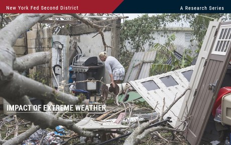
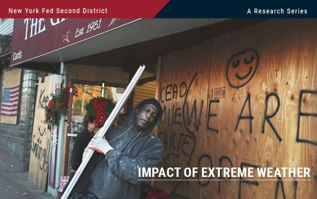
Climate Change
First Past the Post Voting System Barrier to Urgent Action on Climate Crisis, Major Environmental Groups Say
 Newsletter offer
Subscribe to our newsletter for exclusive editorial emails from the Byline Times Team.
The UK’s largest environmental organisations have come together ahead of next week’s global COP28 summit to call for voting reform to help tackle the climate crisis.
Organisations backing the campaign – initiated by cross-party campaign group Compass – include Greenpeace, Friends of the Earth, Green New Deal Rising, and Rapid Transition Alliance. It is understood to be the first time Greenpeace has backed electoral reform to tackle the climate crisis.
Researchers analysed British Social Attitudes survey data for cross-party progressive group Compass and found that Westminster’s First Past the Post voting system “distorts our debate on climate”.
Campaigners endorsing the report say the UK’s 'winner-takes-all' electoral system – whereby only the one winner’s votes in each seat contribute result in representation – acts as a “political stranglehold” that prevents governments from taking meaningful action on climate, locking the country into a “fossil-fuelled status quo”.
The Westminster voting system’s focus on swing seats and their constituents reduces the scope of political debate, excludes vast swathes of voters, and gives the already rich and powerful – especially party donors and media magnates – a disproportionate influence over our politics, according to the report.
Don't miss a story
To win under FPTP, parties have to promise small groups of influential voters who have the greatest voting power. In England, those voters tend to be most separated from the climate crisis, Compass argues.
Britain’s current economic and cultural geography means more progressive voters tend to be located in ever greater numbers in cosmopolitan cities. But these are often safe progressive seats, and aren’t the places that win elections – the swing seats are, the analysis shows.
The coalition of green groups also argue FPTP also discourages the kind of cooperative, cross-party working that will be necessary to tackle issues as all-consuming as the climate crisis.
Studies show that 76% of Brits support reaching net zero, and 52% want the Government to do more to tackle climate change. But FPTP allows candidates to win with just a third of the vote in each seat, resulting in millions of wasted votes. The vast majority of votes – 70% – did not contribute to the local result in 2019, according to the Electoral Reform Society.
Pro-environmental voters are more concentrated in certain areas, but not enough to swing local elections. In contrast, votes of climate sceptics are more “efficiently” spread across the country, according to the paper.

EXCLUSIVE
Dr Gail Bradbrook had been threatened with contempt of court for giving her motivations for direct action. She carried on through over a dozen interruptions.
Josiah Mortimer
Parties have been found to spend up to 22 times more on reaching so-called swing seat voters compared to those in safe seats in previous elections.
FPTP also reinforces England’s two-party system, focusing decision-making and power in the hands of a few people at the top of these two parties, the 'Democratise to Decarbonise' report finds. Smaller parties such as the Greens find it much harder to secure representation that reflects their vote share.
In one recent poll by Find Out Now, in which voters were asked how they would vote if each party had an equal chance of winning, the Green Party vote went up from 6% to 19%.
In 2019, it took the Conservatives just 38,000 votes to get an MP elected on average, while Labour needed 53,000, the Liberal Democrats 250,000, and the Greens 865,000 for their one MP in Brighton Pavilion.
Countries with proportional representation systems have slowed their carbon dioxide emissions more than four times as quickly as winner-take-all countries, the study finds.
Between 1990 and 2007, as carbon emissions were rising, the increase in carbon emissions of countries with winner-takes-all voting systems was statistically predicted to be almost five times higher (at 45.5%) than countries with fully proportional voting systems at 9.5%.
Studies have also found that use of renewable energy is 117% higher in countries with fully proportional systems compared to countries with majoritarian voting systems.
Campaigners are asking supporters to sign a petition to Cabinet and Shadow Cabinet ministers responsible for climate change to urge them to back voting reform as the cornerstone of action on the climate emergency.

‘From BP to Banks: There’s Lots of Money Around – It’s Just Not In Workers’ Pockets’
Despite Government calls for pay restraint, new figures show some people are doing very well out of the cost of living crisis, writes Josiah Mortimer
Josiah Mortimer
Rebecca Newsom, head of politics at Greenpeace UK, said: “Many of us across the UK – no matter who we vote for – are horrified at the increasing scale and intensity of extreme weather events on our screens and in our neighbourhoods. Red alert storms and flooding claiming lives in the UK; deadly wildfires and heat waves destroying lives and livelihoods around the world. And it’s getting worse.
“But when it comes to elections, so many votes cast for politicians standing to take climate action are lost due to our winner-take-all First Past the Post system.”
She added that many people’s votes “effectively count for nothing”.
“Proportional representation is not only fairer, but it would supercharge people power in the UK: ensuring that every single voice is heard and the issues they care about represented in Parliament,” Newsom said.
Hannah Martin, co-director of Green New Deal Rising, added that Westminster’s First Past the Post voting system is “woefully ill-equipped to deliver any meaningful change”.
“Our crooked voting system prioritises short-term political gain over the long-term priorities of people and the planet,” she said.
Neal Lawson, director of Compass, noted that simply “changing the party pulling the levers in Whitehall will not fix” Britain’s short-termist political system, which often sees big, disruptive changes between governing parties, as opposed to more stable consensus-based systems.
“Our ability to win climate justice in this country rests on breaking the stranglehold of FPTP and our centralised, and narrow politics,” Lawson said.
Read Compass’ report 'Democratise to Decarbonise’
 Subscribers Get More from JOSIAH
Josiah Mortimer also writes the On the Ground column, exclusive to the print edition of Byline Times.
So for more from him...


Do you have a story that needs highlighting? Get in touch by emailing josiah@bylinetimes.com
Australian grab for regional domination behind Tuvalu climate treaty
Labor is framing its new treaty with the tiny Pacific nation of Tuvalu, which will allow 280 people a year to move to Australia, as an act of climate change solidarity.
But the primary motivation is to strengthen Australian influence in the South Pacific and block China’s search for allies.
Behind the climate rhetoric, the new treaty gives Australia a veto over Tuvalu’s ability to make any “any partnership, arrangement or engagement with any other State or entity on security and defence-related matters.
“Such matters include but are not limited to defence, policing, border protection, cyber security and critical infrastructure, including ports, telecommunications and energy infrastructure.”
The treaty comes 19 months after China signed a security pact with the Solomon Islands—a move that sparked panic in the Australian ruling class, which regards the region as its own.
Prime Minister Anthony Albanese and Tuvaluan Prime Minister Kausea Natano announced the agreement at the Pacific Islands Forum meeting in the Cook Islands, with Australia making it clear the option was open for other countries in the region to sign similar agreements.
Falepili Union
Tuvalu, a British colony until 1978, consists of nine islands about halfway between Australia and Hawaii. It has a population of about 11,200 and, at its highest, is just 4.6 metres above sea level.
Albanese said that Tuvalu’s “very existence is threatened. I believe developed nations have a responsibility to provide assistance”.
Under the treaty or Falepili Union (based on a Tuvaluan word for neighbourliness), Australia will offer Tuvaluans a “human mobility pathway” to allow them to live, study and work in Australia, with access to education, health, and income and family support on arrival.
The two countries also commit “to work together in the face of the existential threat posed by climate change”. Australia will spend $16.9 million to expand land areas of Tuvalu’s main islands by 6 per cent.
But these are empty gestures while the Albanese government continues to approve new coal and gas projects.
As the Tuvalu Climate Action Network points out, Australia is failing “to effectively address the root cause of Tuvalu’s existential threat—the devastating impacts of climate change primarily driven by the combustion of fossil fuels …
“Offering residence or citizenship rights to Tuvaluans, though a compassionate response, does not halt the inexorable rise in sea levels.”
Academics Taukiei Kitara and Carol Farbotko report that many Tuvaluans have no interest in leaving their homes.
They write, “Research indicates that, with adaptation measures, the habitability of atolls can continue into the 21st century, despite rising sea levels … The treaty should not be interpreted as an indication that the worst-case scenario has arrived or is imminent.”
They add, “Our gravest concerns about the treaty are that it sidesteps the important question of Australia’s commitment to phasing out fossil fuels.”
While Australia should open its borders to climate refugees, the priority should be to stop global heating.
But Labor refuses to rule out new fossil fuel projects because of the massive role coal, gas and oil play in the Australian economy. In 2022, coal exports alone were worth a massive $142 billion.
Cold calculation
Behind Labor’s posturing about climate solidarity is a cold calculation about the importance of binding Tuvalu to Australia and preventing China extending its influence.
Tuvalu’s land mass is tiny but its exclusive economic zone is almost 750,000 square kilometres—similar in size to NSW.
It is currently one of the few countries in the Pacific that still maintains a diplomatic relationship with Taiwan, rather than China.
Nine countries have switched allegiance to China since 2016, leaving Taiwan with just 13 allies worldwide.
Now Australia wants to lock island nations into treaties in order to lock out China.
As Solidarity reported when the Solomon Islands signed a security agreement with China in April 2022, establishment commentators warned the deal “would give the People’s Liberation Army navy an operating base deep within Australia’s strategic hinterland” and “would signal a pretty significant failure of Australia’s long-term security policy”.
Albanese and Foreign Minister Penny Wong have been working hard since then to ensure China makes no further progress.
Vast areas of the globe are in play. Professor Jack Corbett from Monash University wrote in The Age, “The language of ‘union’ signals that the government hopes other countries, especially Kiribati and Nauru, might be open to a similar deal. If they are, then the map of the Pacific would suddenly look quite different.
“The US would maintain strategic denial in the North Pacific via Guam, its Commonwealth with the neighbouring Mariana Islands, and its Compacts of Free Association with Palau, Federated States of Micronesia and Marshall Islands.
“Tokelau is a dependent territory of New Zealand, which also has a free association arrangement with Cook Islands and Niue, and longstanding links with Samoa. France retains French Polynesia and New Caledonia.
“If the Falepili Union were to include Kiribati and Nauru as well as Tuvalu, then the North, Central and South Pacific would all comprise territories friendly to Australia that protect our air and sea-lanes from a Chinese approach.”
Regional power
Australia has been the regional power in the South Pacific since the 19th century.
From the point of view of Australian capitalism, it is crucial to control the shipping lanes that run through the region.
Malcolm Fraser’s Coalition government quadrupled aid to island nations in 1976 as a direct response to the feelers the Soviet Union was extending to some of the newly-independent island nations.
Today, our rulers fear interference by China—ignoring, of course, the much more substantial stake in the Pacific held by the US and France.
The treaty with Tuvalu pays lip service to humanitarian aims but is, in reality, another step by Australia to shore up its power.
Ordinary people in Australia and Tuvalu have nothing to gain from this rivalry. Instead we need to unite for real action on climate change.
By David Glanz
The post Australian grab for regional domination behind Tuvalu climate treaty first appeared on Solidarity Online.
Banks versus Hurricanes
The impacts of hurricanes analyzed in the previous post in this series may be far-reaching in the Second District. In a new Staff Report, we study how banks in Puerto Rico fared after Hurricane Maria struck the island on September 17, 2017. Maria makes a worst case in some respects because the economy and banks there were vulnerable beforehand, and because Maria struck just two weeks after Hurricane Irma flooded the island. Despite the immense destruction and disruption Maria caused, we find that the island’s economy and banks recovered surprisingly quickly. We discuss the various protections—including homeowners’ insurance, federal aid, and mortgage guarantees—that helped buttress the island’s economy and banks.
Double Strike
Puerto Rico’s location in the Caribbean leaves it highly exposed to all manner of severe weather, including floods, droughts, tropical storms, and winter swells. Since 1955, FEMA has declared forty-five disasters there, twenty-eight of which were hurricanes or severe storms.
The Paths of Hurricanes Maria and Irma
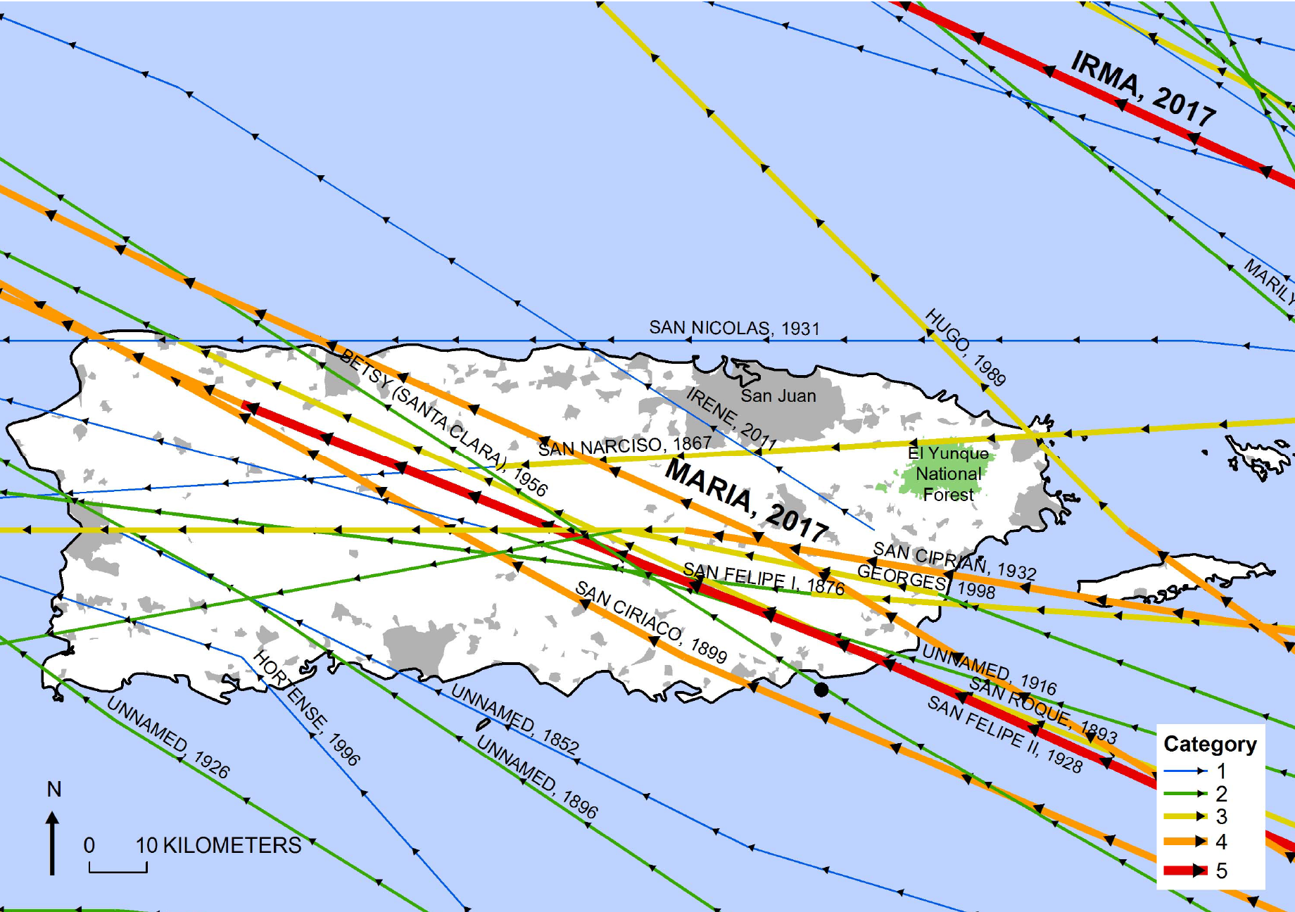
Source: U.S. Geological Survey.
The full fury of Irma (the eye) passed thirty miles north of the main island of Puerto Rico on September 6, but the island was still buffeted by 55 mph winds and a foot of rain in places. Culebra and Vieques, smaller islands off the main island, were especially hard hit. The island was still reeling from Irma when Maria struck full force on September 17, with winds of 155 mph and maximum rainfall of 38 inches in 48 hours. Maria destroyed 80 percent of the island’s electrical grid and blacked out most of Puerto Rico’s 3.4 million residents for months. Thousands of homes were damaged or destroyed. Flash floods caused landslides and destroyed many bridges. FEMA estimated damages from Maria at $90 billion, making it the third costliest hurricane in U.S. history. The combined damages from Maria and Irma nearly exceeded the island’s $104 billion GDP in 2016.
Economic Impact
The chart below tracks employment in Puerto Rico using August 2017 as the benchmark (100). The trend was flat or downward before Maria struck, reflecting longer-term economic difficulties that are discussed in our paper. Employment fell sharply, about 7 percent, after Maria but had fully recovered by July 2018. Interestingly, employment grew faster afterwards than before Maria, consistent with this recent study documenting positive medium-term effects of weather disasters on local employment and income.
Puerto Rico’s Employment Fell Sharply after Maria but Recovered Quickly
Index, August 2017 = 100
{"padding":{"auto":false,"left":28},"color":{"pattern":["#61AEE1","#B84645","#B1812C","#046C9D","#9FA1A8","#DCB56E"]},"interaction":{"enabled":true},"point":{"show":false},"data":{"groups":[],"labels":false,"type":"line","order":"desc","selection":{"enabled":false,"grouped":true,"multiple":true,"draggable":true},"x":"Date","xFormat":"%Y-%m-%d","rows":[["Date","All Employees: Total Private in Puerto Rico, Index Aug 2017=100, Monthly, Seasonally Adjusted"],["2016-01-01","101.3"],["2016-02-01","100.9"],["2016-03-01","100.9"],["2016-04-01","101.0"],["2016-05-01","100.9"],["2016-06-01","101.0"],["2016-07-01","101.0"],["2016-08-01","100.9"],["2016-09-01","101.3"],["2016-10-01","101.5"],["2016-11-01","101.2"],["2016-12-01","101.0"],["2017-01-01","101.1"],["2017-02-01","101.0"],["2017-03-01","101.0"],["2017-04-01","100.5"],["2017-05-01","100.6"],["2017-06-01","100.9"],["2017-07-01","100.1"],["2017-08-01","100.0"],["2017-09-01","99.0"],["2017-10-01","93.0"],["2017-11-01","94.7"],["2017-12-01","97.3"],["2018-01-01","96.7"],["2018-02-01","97.4"],["2018-03-01","97.8"],["2018-04-01","98.8"],["2018-05-01","99.2"],["2018-06-01","99.7"],["2018-07-01","100.3"],["2018-08-01","100.6"],["2018-09-01","100.8"],["2018-10-01","100.3"],["2018-11-01","100.9"],["2018-12-01","100.5"],["2019-01-01","101.8"],["2019-02-01","102.0"],["2019-03-01","102.5"],["2019-04-01","102.8"],["2019-05-01","102.8"],["2019-06-01","102.9"],["2019-07-01","102.6"],["2019-08-01","102.9"],["2019-09-01","103.3"],["2019-10-01","103.3"],["2019-11-01","103.4"],["2019-12-01","103.4"],["2020-01-01","103.3"]]},"legend":{"show":false,"position":"bottom"},"tooltip":{"show":true,"grouped":true},"axis":{"rotated":false,"x":{"show":true,"type":"timeseries","localtime":true,"tick":{"centered":false,"culling":false,"fit":true,"outer":true,"multiline":false,"multilineMax":0,"format":"%b %Y","values":["2016-01-01","2017-01-01","2018-01-01","2019-01-01","2020-01-01"]},"label":{"text":"","position":"outer-center"},"format":"%Y-%m-%d"},"y":{"show":true,"inner":false,"type":"linear","inverted":false,"tick":{"centered":false,"culling":false},"padding":{"top":3,"bottom":0},"primary":"","secondary":"","label":{"text":"","position":"outer-middle"},"max":105,"min":93},"y2":{"show":false,"inner":false,"type":"linear","inverted":false,"padding":{"top":3},"label":{"text":"","position":"outer-middle"}}},"grid":{"x":{"show":false,"lines":[],"type":"indexed","stroke":""},"y":{"show":true,"lines":[],"type":"linear","stroke":""}},"regions":[],"chartLabel":"Index, August 2017 = 100","trend":{"show":false,"label":"Trend"},"zoom":false,"subchart":false,"download":true,"downloadText":"Download chart","downloadName":"chart"}
Source: FRED, Federal Reserve Bank of St. Louis.
Notes: Chart plots total private employment in Puerto Rico relative to August 2017.
Bank Impact
There were three banks headquartered in Puerto Rico when Maria struck, institutions that collectively held 75 percent of all domestic deposits on the island. In our analysis, we compare these banks’ performance to a control group of U.S. banks that were not exposed to any type of weather disasters over the post-hurricane comparison period.
The first sign of trouble at banks is usually mounting loan delinquencies. The left panel below shows that delinquencies at Puerto Rico banks rose after Maria, particularly compared to the control, but the deterioration was modest and fairly short-lived. Bank income also fell sharply afterward, as shown in the right panel, but rebounded within two quarters.
Puerto Rico Banks’ Performance Deteriorated after Maria but Rebounded Quickly
Loan Delinquency Rate
Percent
Percent
{"padding":{"auto":false,"left":27,"right":27},"color":{"pattern":["#61AEE1","#B84645","#B1812C","#046C9D","#9FA1A8","#DCB56E"]},"interaction":{"enabled":true},"point":{"show":false},"data":{"groups":[],"labels":false,"type":"line","order":"desc","selection":{"enabled":false,"grouped":true,"multiple":true,"draggable":true},"x":"Date","xFormat":"%m\/%d\/%Y","rows":[["Date","Control (left scale)","Puerto Rico Banks (right scale)"],["1\/1\/2015","0.182","2.660"],["4\/1\/2015","0.196","2.755"],["7\/1\/2015","0.187","2.722"],["10\/1\/2015","0.172","2.632"],["1\/1\/2016","0.208","2.721"],["4\/1\/2016","0.197","2.572"],["7\/1\/2016","0.214","2.542"],["10\/1\/2016","0.173","2.543"],["1\/1\/2017","0.190","2.575"],["4\/1\/2017","0.194","2.529"],["7\/1\/2017","0.197","2.563"],["10\/1\/2017","0.167","2.639"],["1\/1\/2018","0.183","2.656"],["4\/1\/2018","0.197","2.694"],["7\/1\/2018","0.192","2.619"],["10\/1\/2018","0.156","2.543"],["1\/1\/2019","0.187","2.453"],["4\/1\/2019","0.191","2.397"],["7\/1\/2019","0.179","2.199"]]},"legend":{"show":true,"position":"bottom"},"tooltip":{"show":true,"grouped":true},"axis":{"rotated":false,"x":{"show":true,"type":"timeseries","localtime":true,"tick":{"centered":false,"culling":false,"fit":true,"outer":true,"multiline":false,"multilineMax":0,"format":"%Y:$QQ","values":["7\/1\/2015","7\/1\/2017","7\/1\/2019"]},"label":{"text":"","position":"outer-center"},"format":"%Y-%m-%d"},"y":{"show":true,"inner":false,"type":"linear","inverted":false,"tick":{"centered":false,"culling":false,"values":["0.4","0.3","0.2","0.1"]},"padding":{"top":3,"bottom":0},"primary":"","secondary":["Puerto Rico Banks","Puerto Rico Banks (right scale)"],"label":{"text":"","position":"outer-middle"},"max":0.4,"min":0.1},"y2":{"show":false,"inner":false,"type":"linear","inverted":false,"padding":{"top":3},"label":{"text":"","position":"outer-middle"},"max":3,"min":1,"tick":{"values":["3","2","1"]}}},"grid":{"x":{"show":false,"lines":[{"value":"7\/1\/2017","text":"","position":""}],"type":"indexed","stroke":""},"y":{"show":true,"lines":[],"type":"linear","stroke":""}},"regions":[],"chartLabel":"Percent","chartLabel2":"Percent","trend":{"show":false,"label":"Trend"},"zoom":false,"subchart":false,"download":true,"downloadText":"Download chart","downloadName":"chart"}
Bank Income
Log
{"padding":{"auto":false,"bottom":21,"right":22,"left":24},"color":{"pattern":["#61AEE1","#B84645","#B1812C","#046C9D","#9FA1A8","#DCB56E"]},"interaction":{"enabled":true},"point":{"show":false},"data":{"groups":[],"labels":false,"type":"line","order":"desc","selection":{"enabled":false,"grouped":true,"multiple":true,"draggable":true},"x":"Date","xFormat":"%m\/%d\/%Y","rows":[["Date","Control","Puerto Rico Banks"],["1\/1\/2015","N\/A","17.468"],["4\/1\/2015","12.632","17.877"],["7\/1\/2015","12.688","16.573"],["10\/1\/2015","12.605","17.199"],["1\/1\/2016","12.670","17.103"],["4\/1\/2016","12.711","17.087"],["7\/1\/2016","12.721","17.135"],["10\/1\/2016","12.644","17.141"],["1\/1\/2017","12.676","17.155"],["4\/1\/2017","12.771","17.226"],["7\/1\/2017","12.803","16.446"],["10\/1\/2017","12.632","17.177"],["1\/1\/2018","12.831","17.279"],["4\/1\/2018","12.916","17.307"],["7\/1\/2018","12.960","17.413"],["10\/1\/2018","12.874","17.593"],["1\/1\/2019","12.892","17.477"],["4\/1\/2019","12.968","17.469"],["7\/1\/2019","13.042","17.114"]]},"legend":{"show":true,"position":"bottom"},"tooltip":{"show":true,"grouped":true},"axis":{"rotated":false,"x":{"show":true,"type":"timeseries","localtime":true,"tick":{"centered":false,"culling":false,"fit":true,"outer":true,"multiline":false,"multilineMax":0,"format":"%Y:$QQ","values":["07\/01\/2015","07\/01\/2017","07\/01\/2019"]},"label":{"text":"","position":"outer-center"},"format":"%Y-%m-%d"},"y":{"show":true,"inner":false,"type":"linear","inverted":false,"tick":{"centered":false,"culling":false,"values":["18","16","14","12"]},"padding":{"top":3,"bottom":0},"primary":"","secondary":"","label":{"text":"","position":"outer-middle"},"max":18,"min":12},"y2":{"show":false,"inner":false,"type":"linear","inverted":false,"padding":{"top":3},"label":{"text":"","position":"outer-middle"}}},"grid":{"x":{"show":false,"lines":[{"value":"07\/01\/2017","text":"","position":""}],"type":"indexed","stroke":""},"y":{"show":true,"lines":[],"type":"linear","stroke":""}},"regions":[],"chartLabel":"Log","trend":{"show":false,"label":"Trend"},"zoom":false,"subchart":false,"download":true,"downloadText":"Download chart","downloadName":"chart"}
Sources: Bank call reports and Y9-C filings.
Notes: Panels show means for each period for three Puerto Rico-headquartered banks and a control group of U.S. banks that were not exposed to any (FEMA-declared) weather disaster between 2017:Q3 and 2019:Q3. The vertical line indicates when Maria struck. Delinquency rate = 90 days+ past due. Income is measured in log terms.
We confirmed these effects more rigorously in our paper, where we control for individual bank characteristics and economic conditions. We also look at other bank performance measures, such as capital and default risk, but do not find significant changes. The modest (or null) impacts we find for Puerto Rico banks, though possibly surprising, are consistent with the results of other recent studies (Blickle et al., 2022; Brei et al., 2016; Gallagher and Hartley, 2017).
Mitigated Disasters
Despite the aggregate catastrophic impacts of Irma-Maria, multiple layers of protection helped mitigate the impact (see chart below).
Layers of Disaster Protection
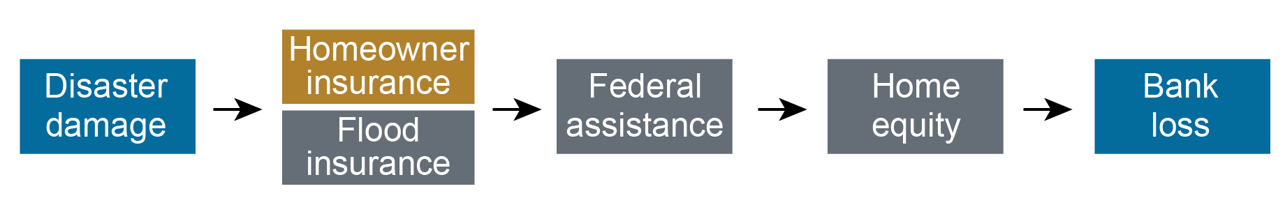
The first mitigant is homeowner’s and flood insurance. By enabling homeowners to repair damaged property, rather than abandon it, insurance protects lenders indirectly.
Federal disaster assistance may also provide indirect protection. Puerto Rico received $20.6 billion in FEMA aid after Irma-Maria, $19.3 billion in public assistance for rebuilding infrastructure, and $1.4 billion in individual assistance to aid uninsured households and individuals. By supporting employment and recovery, this aid may have benefited banks indirectly, but the benefit is difficult to quantify.
Mortgage insurance through the Veteran’s Administration and Federal Housing Administration provided direct protection to banks. These agencies guarantee mortgage repayment in the event of default due to damage to the home or unemployment (among other events). Using McDash data, we found that over 30 percent of mortgages in Puerto Rico were covered by one or the other guarantee when Irma-Maria hit. Loss rates on those mortgages through November 2019 were just 0.1 to 0.2 percent, compared to 1 percent on conventional mortgages without private or government mortgage insurance.
Borrower’s home equity is another layer of direct protection to banks, one they control though their underwriting. In Puerto Rico, however, home equity had been declining for years before 2017, as the long economic downturn depreciated home prices. Thus, home equity levels likely did not provide strong support to banks holding these mortgages.
Takeaways
Puerto Rico banks were surprisingly resilient against the back-to-back hurricanes that wracked the island in September 2017, thanks to the mitigating effects of property insurance, federal mortgage insurance and disaster assistance, and, to a lesser extent, their own underwriting. This finding is reassuring from a financial stability perspective, but also for households that might need additional credit to rebuild and recover from weather disasters. We caution, however, that these mitigants may themselves be threatened by climate change if private and federal insurers withdraw from disaster zones or increase coverage costs prohibitively or if federal disaster assistance becomes scarcer.

Peter Anagnostakos is a quality management supervising examiner in the Federal Reserve Bank of New York’s Supervision Group.
Jason Bram was a research officer in the Federal Reserve Bank of New York’s Research and Statistics Group.

Benjamin Chan is an institutional supervision program manager in the Federal Reserve Bank of New York’s Supervision Group.

Natalia Fischl-Lanzoni is a research analyst in Financial Intermediation in the Federal Reserve Bank of New York’s Research and Statistics Group.

Hasan Latif is an institutional supervision supervising examiner in the Federal Reserve Bank of New York’s Supervision Group.

James M. Mahoney is an institutional supervision program director in the Federal Reserve Bank of New York’s Supervision Group.

Donald P. Morgan is a financial research advisor on Banking Studies in the Federal Reserve Bank of New York’s Research and Statistics Group.

Ladd Morgan is a capital markets risk supervising examiner in the Federal Reserve Bank of New York’s Supervision Group.

Ivelisse Suarez is an institutional supervision supervising examiner in the Federal Reserve Bank of New York’s Supervision Group.
How to cite this post:
Peter Anagnostakos, Jason Bram, Benjamin Chan, Natalia Fischl-Lanzoni, Hasan Latif, James M. Mahoney, Don Morgan, Ladd Morgan, and Ivelisse Suarez, “Banks versus Hurricanes,” Federal Reserve Bank of New York Liberty Street Economics, November 20, 2023, https://libertystreeteconomics.newyorkfed.org/2023/11/banks-versus-hurri....
Climate Change and Financial Stability: The Weather Channel
Banks versus Hurricanes: A Case Study of Puerto Rico after Hurricanes Irma and Maria
Disclaimer
The views expressed in this post are those of the author(s) and do not necessarily reflect the position of the Federal Reserve Bank of New York or the Federal Reserve System. Any errors or omissions are the responsibility of the author(s).
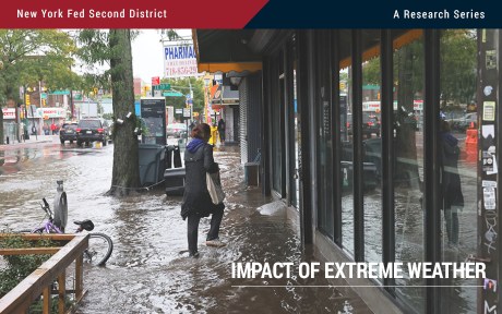
Flood-Prone Basement Housing in New York City and the Impact on Low- and Moderate-Income Renters
Hurricane Ida, which struck New York in early September 2021, exposed the region’s vulnerability to extreme rainfall and inland flooding. The storm created massive damage to the housing stock, particularly low-lying units. This post measures the storm’s impact on basement housing stock and, following the focus on more-at-risk populations from the two previous entries in this series, analyzes the attendant impact on low-income and immigrant populations. We find that basements in select census tracts are at high risk of flooding, affecting an estimated 10 percent of low-income and immigrant New Yorkers.
Flood Risk and Basement Data
For our analysis, we combine data on flood risk from the Federal Emergency Management Agency (FEMA) and the First Street Foundation. FEMA’s data primarily rely on coastal and riverine flooding, using the 100-year return period to determine a neighborhood’s flood risk. The First Street Foundation data measure river (fluvial) and precipitation-driven (pluvial) flooding as well as coastal flooding, enabling us to identify flood-prone areas in addition to FEMA’s 100-year floodplain. Flood Factor is determined at the property level and “specifically looks at the likelihood of 1 inch of water reaching the building footprint of a home at least once within the next 30 years.” (Please see First Street Foundation for a description of the 1-10 scale for flood factor.)
Basement dwellings are among the most vulnerable to flooding. We focus on the basement structures that are most likely to be in residential buildings, using the PLUTO (Primary Land Use Tax Lot Output) Database, which contains tax lot-level information about properties and land in New York City. We adopt and modify a data-filtering process from the Citizens’ Housing and Planning Council’s (CHPC) Hidden Housing report and divide basements into “flood-prone” and “viable” categories using flood risk metrics from FEMA and First Street Foundation.
Do Low-Income Renters Face Elevated Risk from Floods?
New York City’s rental housing market is notoriously tight, with a recent report suggesting that the city is facing its worst affordability crisis in two decades. Based on this report, half of the city’s households lack the means to cover the monthly cost of housing, food, healthcare, and transportation, creating challenges for low- and moderate-income (LMI) populations in finding affordable housing. In addition to these general challenges, low-income renters are particularly vulnerable to natural hazards. Standard renters’ insurance does not cover flood damage, and federal relief programs, in the event of a federal disaster declaration, offer only basic coverage for renters.
The map below examines two variables, flood risk and the share of LMI renters by census tract, with deeper shades of green identifying tracts with the highest flood risk and highest share of low-income renters. Deep gold indicates areas that house dense populations of LMI renters but are less flood-prone. Deep blue indicates areas that have the highest flood risk but have less dense populations of LMI renters.
The tracts with the highest flood risk for low-income renters include east Bronx, East Harlem, the east coast of Staten Island, southern and eastern Brooklyn, the Lower East Side of Manhattan, and southern Queens. The census tracts at highest risk tend to be located on coastlines, but there are several census tracts in Brooklyn, Queens, and the Bronx that are located more inland and show a moderate to high risk of pluvial flooding for low-and-moderate income renters. This is a notable danger, as pluvial flooding is not always captured in the flood information used to qualify households for disaster assistance and insurance and suggests that asymmetric information on flood risk may put certain LMI renter households at increased risk of property damage and broader harm from inland flooding.
Flood Risk and LMI Renter Populations in New York City
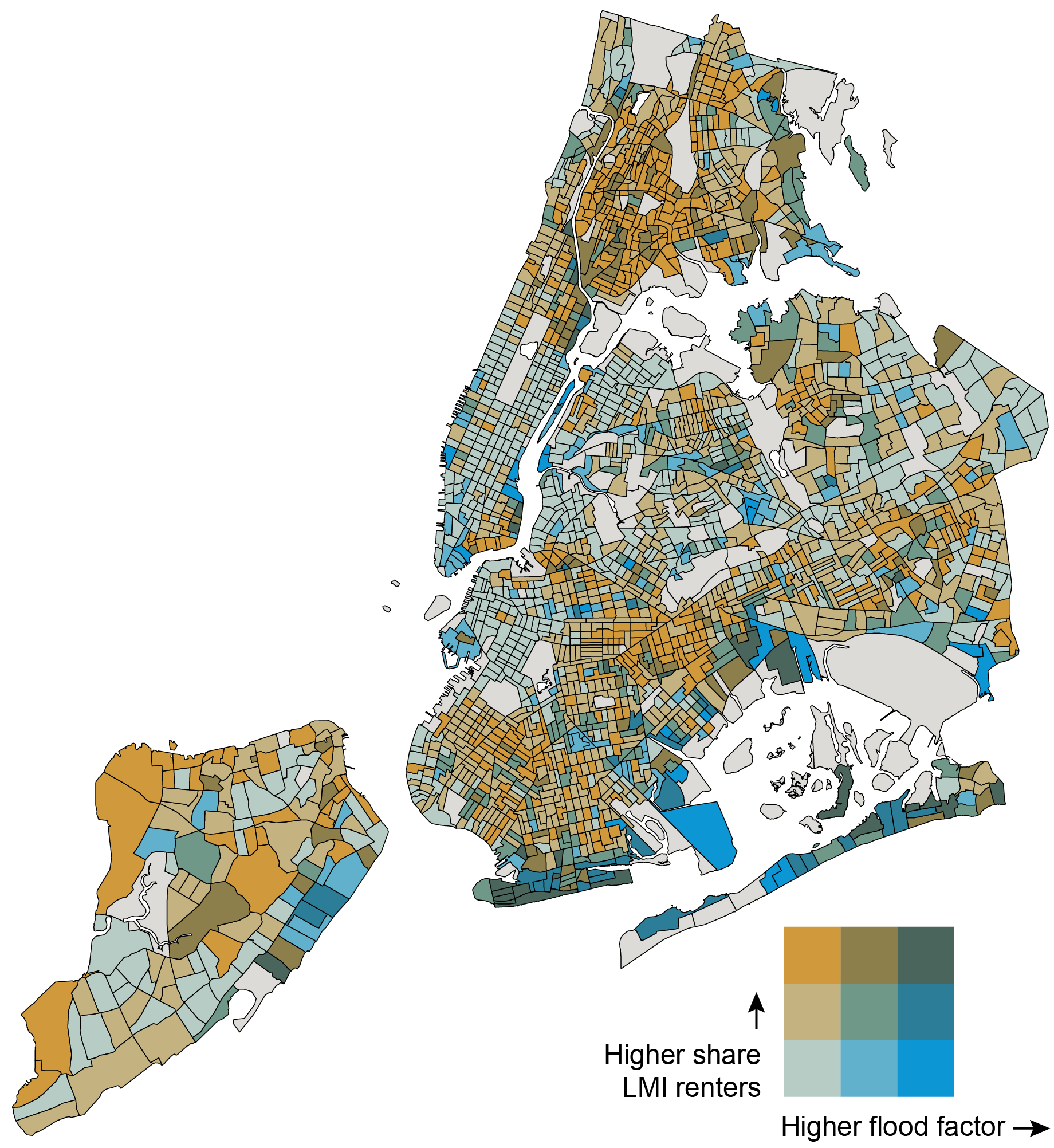
Sources: American Community Survey (5-year, 2017-2021); First Street Foundation (2021).
Notes: Dark gray census tracts indicate areas for which data are not available. The numeric buckets for the flood factor axis are 0-35 percent, 35-67 percent, and 67-100 percent. The numeric buckets for the share of LMI renters axis are 0-31 percent, 31-64 percent, and 64-100 percent.
Where Is Basement Housing Stock Relative to Flood Risk and LMI Renter Populations?
For neighborhoods with higher populations of LMI renters and/or acute housing shortages, basement housing can serve as an important part of the housing stock. Average rental costs of basement dwellings are lower than above-ground apartments, with savings estimates of 20 percent or more. This makes basement apartments attractive to thousands of New Yorkers.
In the table below, we estimate the amount of basement housing stock that is vulnerable to flooding. This refers to basements in census tracts where the flood factor defined by First Street Foundation is greater than 3 (encompassing moderate, 3-4, to severe, 9-10, flooding) and the share of properties in a Special Flood Hazard Area is greater than 10 percent.
Flood Risk Implications for LMI Renters in Potential Basement Housing Stock
NYC Census Tracts Low Share LMI Renters (<30%)Moderate to High Share LMI Renters (≥30%)Low Flood Risk
(< 3 FF, < 10% SFHA)45,403 basements
(19% of all basements) 168,668 basements
(72% of all basements) Major to High Flood Risk
(≥ 3 FF, ≥ 10% SFHA)503 basements
(<1% of all basements)4,065 basements
(2% of all basements) Sources: American Community Survey (5-year, 2021); First Street Foundation (2021).
Notes: Percentages in the table do not add up to 100 percent, because the basements that may either be in a census tract where the flood factor is less than 3 and the share of SFHA properties is greater than or equal to 10 percent OR a census tract where the flood factor is greater or equal to 3 and the share of SFHA properties is less than 10 percent are not included in the potential basement housing stock, but are included in the total number of basements.
The most vulnerable census tracts are those with higher shares of LMI renters and higher flood risk, and we estimate that potentially 4,065 basement units are likely to house LMI renters in areas at risk of major to severe flooding. This is eight times the number of basement units (503) located in high flood risk census tracts with smaller populations of LMI renters, where there is a smaller likelihood of basement unit residents. While basements in areas with high flood risk and higher shares of LMI renters constitute 2 percent of all basements in the city, 72 percent of all basements in the city occur in areas with low flood risk and higher shares of LMI renters, indicating a presence of safer and more viable basement housing stock for LMI renter populations that have limited housing choice.
Basement Housing: Viable versus Flood-Prone
We categorize census tracts (and the basements in them) as “flood-prone” if they have a flood factor of 3 or above (encompassing moderate, 3-4, to severe, 9-10, flooding) and/or if more than 10 percent of the properties in the census tract fall in a Special Flood Hazard Area (SFHA). “Viable” basements are in census tracts that have a flood factor of below 3 and less than 10 percent of properties in an SFHA.
The map below indicates that basement dwellings in most census tracts in New York City are viable, but census tracts vary in the density of basements. High concentrations of viable basements are in southern Staten Island, southern Brooklyn, southern Queens, and Flushing, while higher concentrations of flood-prone basements are in East Harlem, eastern Staten Island, the east and south Bronx, and, notably, parts of southern Brooklyn, southern Queens, and Flushing.
Density of Potential Basement Dwellings by Census Tract (Viable vs. Flood-Prone)
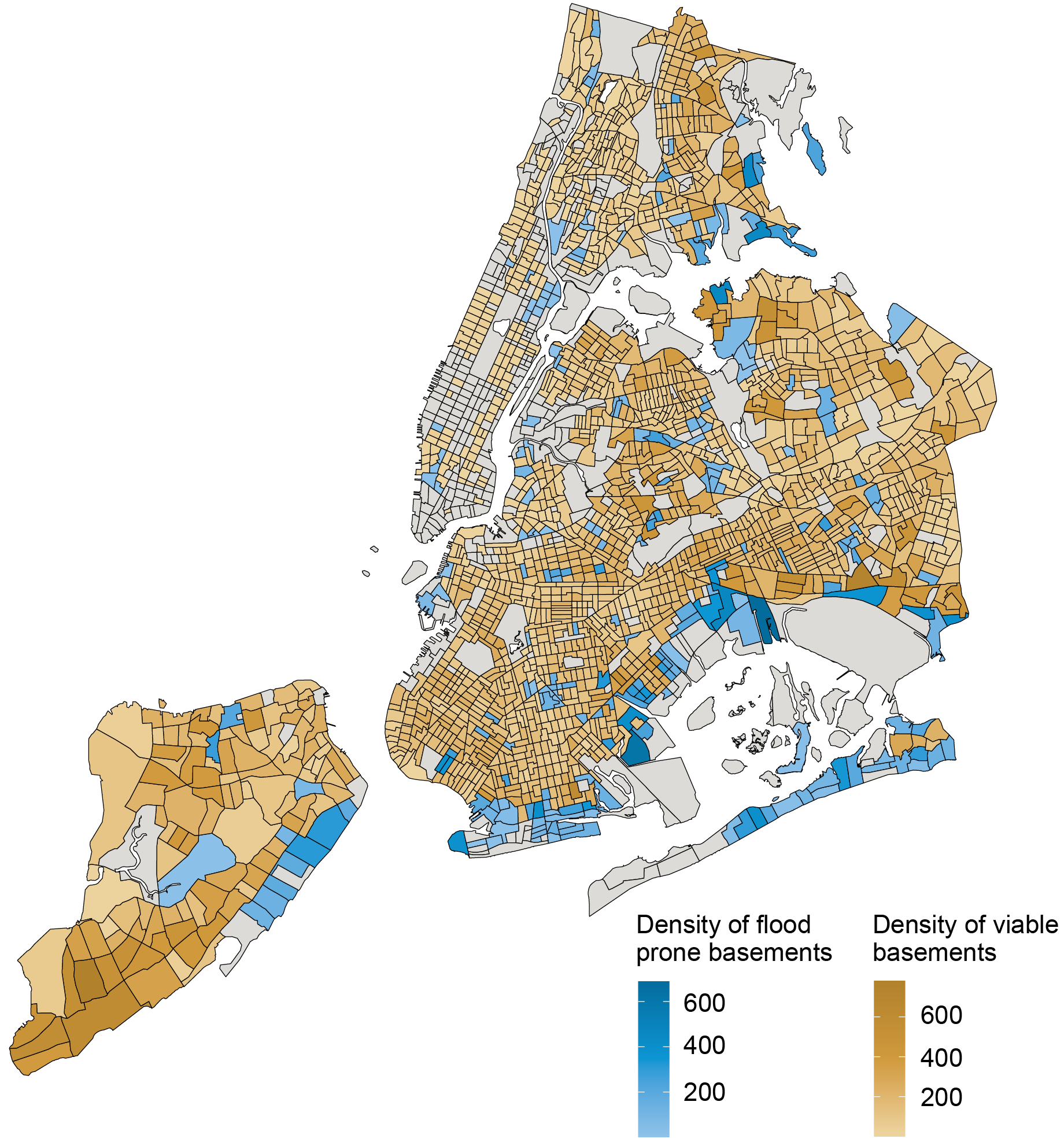
Sources: PLUTO NYC Database version 23.1; First Street Foundation (2021); FEMA.
Notes: Dark grey areas indicate that there are no identifiable potential basement dwellings in the census tract, given the data filtering process we undertook.
The highest densities of flood-prone basement housing still occur along the coastlines of the city, particularly in Canarsie, Coney Island, Howard Beach, and East New York. These basement units are also in census tracts with severe to extreme flood risk scores.
In the table below, we calculate the shares of low- and moderate-income people, immigrants, and racial/ethnic minorities living in a flood-prone census tract. Approximately one in ten LMI individuals, immigrants, and racial/ethnic minorities in New York City live in a flood-prone census tract, a significant share of each of these populations. The informality of basement housing often means that the city’s most vulnerable communities are likely to take up residence in these dwellings.
Flood Prone Census Tracts by Demographics
LMIImmigrantsRacial/Ethnic MinoritiesCensus Tracts with
Flood-Prone Basements 9%9%10%Sources: American Community Survey (5-year, 2017-2021); First Street Foundation (2021); FEMA.
Note: Percentages reflect the share of the total population in tracts with moderate to high flood risk (flood factor of 3 or above and >10 percent of properties in a Special Flood Hazard Area).
Conclusion
This blog post introduces new data to estimate with greater precision the flood risk to basement apartments in New York City. We show that these risks potentially affect roughly 10 percent of LMI individuals, immigrants, and racial and ethnic minorities. For expanded analysis and insights, please look for our upcoming report on flood risk and basement housing in New York City, to be released by the New York Fed’s Community Development & Outreach Group.
As the formalization of the city’s basement housing stock is debated, it is important to consider accounting for both inland and coastal flooding and the vulnerability of LMI, immigrant, and minority populations in assessing viable basement housing stock. The importance of considering the impact of extreme events like hurricanes on activity in the Federal Reserve’s Second District is further examined in the next blog post of this series, which examines the impact of hurricanes on Puerto Rican banks.

Claire Kramer Mills is a community development research manager in the Federal Reserve Bank of New York’s Communications and Outreach Group.

Ambika Nair is a community development outreach analyst in the Federal Reserve Bank of New York’s Communications and Outreach Group.

Julian di Giovanni is the head of Climate Risk Studies in the Federal Reserve Bank of New York’s Research and Statistics Group.
How to cite this post:
Claire Kramer Mills, Ambika Nair, and Julian di Giovanni, “Flood-Prone Basement Housing in New York City and the Impact on Low- and Moderate-Income Renters,” Federal Reserve Bank of New York Liberty Street Economics, November 17, 2023, https://libertystreeteconomics.newyorkfed.org/2023/11/flood-prone-baseme....
Moving Out of a Flood Zone? That May Be Risky!
How Do Banks Lend in Inaccurate Flood Zones in the Fed’s Second District?
Disclaimer
The views expressed in this post are those of the author(s) and do not necessarily reflect the position of the Federal Reserve Bank of New York or the Federal Reserve System. Any errors or omissions are the responsibility of the author(s).
Q and A with David Stainforth on Predicting Our Climate Future: What We Know, What We Don’t Know, and What We Can’t Know
We speak to David Stainforth about his new book, Predicting Our Climate Future: What We Know, What We Don’t Know, and What We Can’t Know, which argues for a re-evaluation of how we go about the study of climate change in the physical sciences, the social sciences, economics and policy.
You can watch a public LSE event with David Stainforth to launch the book from October 2023 on YouTube here.
Predicting Our Climate Future: What We Know, What We Don’t Know, and What We Can’t Know. David Stainforth. Oxford University Press. 2023.
Find this book: ![]()
 Q: Where did the idea for the book come from and what were you setting out to do in writing it?
Between 2000 and 2015, I became aware that my perspective on what we should be trying to do in climate change science wasn’t at all reflected in the practice of research in research institutions. It seemed to me important to write something that would engage people with all the fascinating challenges that exist in understanding the problems of climate change. Doing so, I hoped, would help make clear the separation between what we know and what we don’t know.
Many big, fundamental, questions – philosophical, mathematical, physical, and economic questions – about climate change tend not to be examined, probably because of the urgency for society to act.
If I was a sixth-former now, I would certainly see climate change as an important issue for society, but I’m not sure I would be passionate about trying to understand it. That’s because it appears that we already understand it, although in fact we don’t. Many big, fundamental, questions – philosophical, mathematical, physical, and economic questions – about climate change tend not to be examined, probably because of the urgency for society to act. My book addresses these questions. I would love for my book to stimulate high-school students and undergraduates across diverse disciplines to say, actually, there’s something really fascinating to get my teeth into here; something that humanity hasn’t yet understood.
Of course, none of this undermines the importance and urgency of acting on climate change, but acting and understanding need to go hand in hand.
Q: What are the limitations of scientists’ understanding of the climate system? How do these affect our ability to predict how the climate will change?
The central issue is complexity and there are two aspects of complexity that create a barrier to predicting what the climate future will look like.
The climate system is made up of many components – the atmosphere, the oceans, land ecosystems, ocean ecosystems, biogeochemical systems, the cryosphere etc. Many of these can be broken down further into subsystems, and all of this is before you get into the social aspects. The first aspect of complexity is simply how these many disparate components interact.
Certain types of system, like the climate system, have real barriers to predictability because what happens in the future can be very sensitive to the state of the system today. This is what’s meant by the “butterfly effect”.
The second aspect of complexity is more mathematical. Certain types of system, like the climate system, have real barriers to predictability because what happens in the future can be very sensitive to the state of the system today. This is what’s meant by the “butterfly effect”. At the same time, the relationship between our models and reality is unclear: how close does a model have to be to reality for it to be able to tell us something about how reality will behave? That’s a difficult question to answer; it might be that our models could represent reality very closely, but still provide unreliable predictions. This is something that Erica Thompson has named the “hawkmoth effect”; it’s something we haven’t really begun to study.
These types of complexity affect how we should be designing our climate models and what sort of experiments we should run with them.
Q: What do Global Climate Models (GCMs) do and what are their limitations?
Global Climate Models break down the atmosphere and ocean into grid points and at each grid point they solve the equations of motion to tell us how things change over time. This is what’s known as a reductionist approach to modelling, and it allows us to work out what the state of the atmosphere or ocean system might be at some point in the future. Solving the equations on a computer can typically only tell us how things will change over about 10 minutes, so you’ve got to repeat the process millions of times to get information for 100 years ahead.
There are lots of elements of the climate system that can’t be modelled [in a reductionist] way, either because we don’t know what the fundamental equations are or because the processes take place on scales that are far too small to include in the models.
But there are lots of elements of the climate system that can’t be modelled that way, either because we don’t know what the fundamental equations are or because the processes take place on scales that are far too small to include in the models. Examples include how ecosystems absorb and release carbon dioxide and how clouds and rainfall form. For these components there are various different ways to approximate the processes at play, but it’s not easy to know how reliable these approximations are. And because all aspects of the climate system affect all the other aspects of the climate system, this means that the model predictions can’t simply be taken as predictions of reality.
Q: Why do we rely so heavily on GCMs for climate prediction and policy development today? Is there a danger in relying too heavily on these models?
When we study climate change, we don’t have multiple climates to examine. The time scales and the system are defined: it’s our real-world climate system that we’re interested in, and how it will change through the 21st century. We are doing an experiment on the real climate system through humanity’s emissions of greenhouse gases, but we’ll only ever get one result, and that will come too late to be of much use to us. The models enable us to study what we can’t study in reality – for instance, multiple possible scenarios of future greenhouse gas emissions. But we need to always remember that we’re studying a model, not reality. The power, the detail and the ubiquity of the models encourages us to avoid asking the big questions about how the model predictions relate to reality – whether what they’re telling us is actually what we think will happen.
When we study climate change, we don’t have multiple climates to examine. The time scales and the system are defined: it’s our real-world climate system that we’re interested in, and how it will change through the 21st century.
Research on climate, particularly with models, has grown out of work on weather forecasting. The reliability of weather forecasts over the last 20 to 30 years has massively improved, principally because of these models. But in the shift from weather forecasting to climate forecasting, we are dealing with a fundamentally different problem. In weather forecasting, we don’t need to get the whole of the climate system right: it’s mainly just about simulating the atmosphere. Furthermore, we repeat the weather forecasting process three or four times a day, so we can compare the model’s predictions against what happens in reality. That means we can test whether our models are doing a good job in a way that is impossible for climate predictions
With climate, you need to bring in many other elements of the climate system, including oceans and ecosystems, and we don’t have the same possibility to verify the results. This puts us in a very different domain, but the problem is that it doesn’t feel that way. It feels as though weather forecasting and climate predictions are very similar because they use similar, related models. This represents a barrier to using the models effectively to help us provide reliable information about future climate.
Q: Why do you argue that greater diversity of climate models rather than greater “realism” of climate models should be the goal for better climate prediction?
Aiming for realism tends to take us to higher and higher resolution models. These models represent atmospheric behaviour better and they look more realistic, but this lulls us into a false sense of security. Despite the “realistic” appearance of these models, we can’t tell if they are accurate because we’ve never observed the planet in the warmed state that we’re interested in.
High-resolution models also take a lot of computing time to run, and consequently they remove the possibility of exploring other uncertainties such as how we represent the carbon cycle or biogeochemical processes. There’s a substantial risk therefore that we adapt society to be resilient to the changes in our models, when what might actually happen could be very different.
If […] we were to address different ways of building our models and of accounting for the many uncertainties, this would give us a diversity of predictions.
If instead we were to address different ways of building our models and of accounting for the many uncertainties, this would give us a diversity of predictions. Having a better understanding of the wide range of different changes that could plausibly happen would enable us to be better prepared and is, in my view, crucial to building a robust response to climate change.
Q: How does the separation between disciplines, which approach the issue in very different ways, hamper our understanding of, and ability to act on, climate change?
Assessments of the economics of climate change and of the consequences for our societies, for our wealth, for our welfare etc., often don’t take sufficient account of the uncertainties in the physical science. There is a real need for economists to understand the processes of the physical sciences better.
Assessments of the economics of climate change and of the consequences for our societies, for our wealth, for our welfare etc., often don’t take sufficient account of the uncertainties in the physical science
However, if we want the physical climate sciences to help us prepare effectively for our future world, then we need to ask, what are the questions that are being addressed by agricultural scientists, by city planners, by economists and by policy makers. Only when we are clear what kind of information is being sought, can we direct the physical sciences in a useful way. At the moment, the physical scientists set the questions and pass on the resulting information to social scientists rather than focusing their experiments and models on what social scientists and society need to know most.
We are stuck in a traditional approach which is not serving society well.
Q: How could we enable greater interdisciplinary research around climate change?
We require big changes in how we do climate change research. We need to be a lot clearer about what we’re trying to address and how the connections between disciplines work. I think that means high-level change to how we study the problem.
Historically climate change research has been very siloed, as academia generally is. There is a need for the research funders to grasp the nettle of wholesale change and for universities and research institutes to come together and create career paths that enable people to research across disciplinary boundaries.
There is a need for the research funders to grasp the nettle of wholesale change and for universities and research institutes to come together and create career paths that enable people to research across disciplinary boundaries.
I don’t think the importance of multidisciplinarity for understanding fundamental features of the threats posed by climate change has been fully recognised. There are still many funding calls that are essentially answer-driven. It’s a “tell us what will happen to this bit of the system” approach, but that’s not what climate change is. You can’t tell what’s going to happen to one aspect without connecting it with everything else. It’s a big, complex problem and needs to be addressed as such.
As a starting point we need funding – 10, 20 million pounds – for a centre that can bring truly diverse researchers together from philosophy to physics to economics, and give them the stability of five to 10 years to work on these problems together. That’s the starting place for better information about our climate future. It’s also the starting place for training a cohort of experts who have both the breadth and depth of knowledge to be able to build climate resilient societies and communicate what climate change risks actually look like.
Note: This interview gives the views of the author, and not the position of the LSE Review of Books blog, or of the London School of Economics and Political Science. The interview was conducted by Anna D’Alton, Managing Editor of LSE Review of Books.
Main Image: Arctic sea ice by Kathryn Hansen / NASA on Flickr.
Small Business Recovery after Natural Disasters in the Fed’s Second District
A previous Liberty Street Economics post found that minority-owned small businesses in the Federal Reserve’s Second District have been particularly vulnerable to natural disasters. Here we focus on the aftermath of disasters (such as hurricanes, floods, wildfires, droughts, and winter storms) and examine disparities in the ability of these firms to reopen their businesses and access disaster relief. Our results indicate that while white- and minority-owned firms remain closed for similar durations, the latter are more reliant on external funding from government and private sources to cope with disaster losses.
How Often and How Long Do Small Businesses Close after Disasters?
As in the previous post, we consider small businesses in three states in the Second District (New York, New Jersey, and Connecticut, omitting Puerto Rico and the U.S. Virgin Islands due to limited data availability), using data from the Small Business Credit Survey (SBCS) for the period 2021-22. The SBCS asked disaster-affected firms: “Did your business temporarily close because of this natural disaster?” For the firms that responded yes, the survey posed a follow-up question asking for an estimate of the length of time for which they were temporarily closed. These responses likely represent lower bounds for closure since a firm that closed temporarily at the time of survey completion may end up remaining closed for longer than reported.
Sixty percent of small businesses overall in our sample that reported natural-disaster-related losses were forced to close temporarily because of a disaster. Fifty-five percent of minority-owned firms were temporarily closed as compared to about 65 percent of white-owned firms (see the left panel of the chart below); minority-owned firms were closed for similar durations as white-owned firms, with 90 percent of businesses shut down for three months or less (see the right panel of the chart below). A firm is defined as minority-owned if at least 51 percent of the firm’s equity stake is held by a minority (that is, an Asian, Black, Native American, or Hispanic) owner. A firm is defined as white-owned if at least 50 percent of the firm’s equity stake is held by non-Hispanic white owners. Race/ethnicity categories are not mutually exclusive.
Minority- and White-Owned Firms in the Region Remain Closed for Similar Durations
Firm temporarily closed
Percent
{"padding":{"auto":false,"left":22},"color":{"pattern":["#046C9D","#D0993C","#9FA1A8","#656D76","#8FC3EA","#0D96D4","#B1812C"]},"interaction":{"enabled":true},"point":{"show":false},"data":{"groups":[],"labels":false,"type":"bar","order":"desc","selection":{"enabled":false,"grouped":true,"multiple":true,"draggable":true},"x":"","rows":[["White, N=177","Minority, N=205"],["64.54","55.24"]]},"legend":{"show":true,"position":"bottom"},"tooltip":{"show":true,"grouped":true},"axis":{"rotated":false,"x":{"show":false,"type":"category","localtime":true,"tick":{"centered":false,"culling":false,"fit":true,"outer":true,"multiline":false,"multilineMax":0},"label":{"text":"","position":"outer-center"},"categories":["Firm temporarily closed"]},"y":{"show":true,"inner":false,"type":"linear","inverted":false,"tick":{"centered":false,"culling":false},"padding":{"top":3,"bottom":0},"primary":"","secondary":"","label":{"text":"","position":"outer-middle"},"max":70,"min":0},"y2":{"show":false,"inner":false,"type":"linear","inverted":false,"padding":{"top":3},"label":{"text":"","position":"outer-middle"}}},"grid":{"x":{"show":false,"lines":[],"type":"indexed","stroke":""},"y":{"show":true,"lines":[],"type":"linear","stroke":""}},"regions":[],"chartLabel":"Percent","trend":{"show":false,"label":"Trend"},"zoom":false,"subchart":false,"download":true,"downloadText":"Download chart","downloadName":"chart"}
Closure length
Percent
{"padding":{"auto":false,"left":22,"bottom":0},"color":{"pattern":["#046C9D","#D0993C","#9FA1A8","#656D76","#8FC3EA","#0D96D4","#B1812C"]},"interaction":{"enabled":true},"point":{"show":false},"data":{"groups":[],"labels":false,"type":"bar","order":"desc","selection":{"enabled":false,"grouped":true,"multiple":true,"draggable":true},"x":"","rows":[["White, N=106","Minority, N=121"],["90.15","90.83"],["9.85","9.17"]]},"legend":{"show":true,"position":"bottom"},"tooltip":{"show":true,"grouped":true},"axis":{"rotated":false,"x":{"show":false,"type":"category","localtime":true,"tick":{"centered":false,"culling":false,"fit":true,"outer":true,"multiline":false,"multilineMax":0},"label":{"text":"","position":"outer-center"},"categories":["Less than three months","Over three months"]},"y":{"show":true,"inner":false,"type":"linear","inverted":false,"tick":{"centered":false,"culling":false},"padding":{"top":3,"bottom":0},"primary":"","secondary":"","label":{"text":"","position":"outer-middle"}},"y2":{"show":false,"inner":false,"type":"linear","inverted":false,"padding":{"top":3},"label":{"text":"","position":"outer-middle"}}},"grid":{"x":{"show":false,"lines":[],"type":"indexed","stroke":""},"y":{"show":true,"lines":[],"type":"linear","stroke":""}},"regions":[],"chartLabel":"Percent","trend":{"show":false,"label":"Trend"},"zoom":false,"subchart":false,"download":true,"downloadText":"Download chart","downloadName":"chart"}
Sources: Federal Reserve Banks, 2021 and 2022 Small Business Credit Surveys.
Notes: The left panel includes only firms that reported disaster-related losses. For respondents in each race/ethnicity category, the bars plot the percentage of firms that responded yes to the question: “Did your business temporarily close because of this natural disaster?” The panel on the right further limits the sample to firms that temporarily closed because of a natural disaster. For each race/ethnicity category, this panel shows the percentage of firms that were closed for the length indicated on the x-axis at the time of survey completion. A firm is defined as minority-owned if at least 51 percent of the firm’s equity stake is held by a minority (that is, an Asian, Black, Native American, or Hispanic) owner. A firm is defined as white-owned if at least 50 percent of the firm’s equity stake is held by non-Hispanic white owners. Race/ethnicity categories are not mutually exclusive. An observation is excluded from the sample if it is missing a response to the question or if the owner’s race is not observed. The sample pools employer and nonemployer firms. Responses by employer and nonemployer firms are weighted separately on a variety of firm characteristics to match the national population of employer and nonemployer firms, respectively. To construct a pooled weight, we use the employer (nonemployer) weight for the sample year if the firm is an employer (nonemployer). The surveys were fielded between September and November of 2021 and 2022.
This result seems surprising given the finding in the previous post that losses from natural disasters make up a greater share of total revenue for minority-owned firms, a fact suggesting that minority-owned firms were more likely to be closed longer. In contrast, in the national sample, we find that minority-owned businesses were disproportionately likely to be closed for more than three months. One explanation may be that different minority businesses were closed for different lengths. Indeed, in the national sample, Black-owned and Hispanic-owned businesses were closed for longer than white-owned and Asian-owned businesses, consistent with results in a 2022 post. Because we aggregate across minority groups due to the small sample sizes in the data, we may be unable to identify those minority businesses in the sample that were particularly adversely affected by disasters and forced to remain closed for extended periods of time.
What Funding Sources Do Small Businesses in the Region Access for Disaster Relief?
Greater access to financial relief following a disaster may mitigate the need for small businesses to remain closed for an extended period following disasters. The SBCS asked respondents that reported disaster losses to indicate the source(s) that they relied on to cope with their losses. Firms could select from multiple options as shown in the table below. A similar fraction (16 percent) of white- and minority-owned firms relied on disaster insurance funds. Among disaster-affected firms, minority-owned businesses disproportionately relied on government relief funds (such as, Federal Emergency Management Agency (FEMA), Small Business Administration (SBA), or other agencies). Thus, 20 percent of minority-owned firms relied on federal relief and 17 percent on state/local relief (versus 15 percent and 12 percent of white-owned firms, respectively). They were also more heavily dependent on donations, crowdfunding, or nonprofit grants: 17 percent of minority-owned firms rely on these sources as compared to just 1 percent of white-owned firms. Minority-owned firms also depend on non-government loans: 24 percent relied on private debt as compared to only 8 percent of white-owned firms. The national sample also indicates the greater reliance of minority-owned firms on external funding, whether from government or private sources (with the exception of private insurance).
Disparities in Funding Sources to Assist with Disaster
Share of AllShare of White-Owned FirmsShare of Minority-Owned FirmsFunding Sources(s) Relied On:Insurance0.15 0.160.16Federal disaster relief funds (e.g., FEMA, SBA)0.170.150.20State/local government disaster relief funds0.140.120.17Donations, crowdfunding, or nonprofit grants0.070.010.17Debt/loans (other than gov’t loans)0.140.080.24Other0.030.050.00Did not rely on external funds0.550.630.41Observations376180196Sources: Federal Reserve Banks, 2021 and 2022 Small Business Credit Surveys (SBCS).
Notes: This table includes only firms in the sample that reported disaster-related losses. The SBCS asks firms reporting losses: “Which of the following sources of funding did your business rely on to cope with these losses? Select all that apply.” The options are listed in the left column of the table. For each race/ethnicity category, the table reports the fraction of firms that relied on a particular source of funding. The columns do not sum to one because survey respondents had the option to select multiple sources. A firm is defined as minority-owned if at least 51 percent of the firm’s equity stake is held by a minority (that is, an Asian, Black, Native American, or Hispanic) owner. A firm is defined as white-owned if at least 50 percent of the firm’s equity stake is held by non-Hispanic white owners. Race/ethnicity categories are not mutually exclusive. An observation is excluded from the sample if it is missing a response to the question or if the owner’s race is not observed. The sample pools employer and nonemployer firms. Responses by employer and nonemployer firms are weighted separately on a variety of firm characteristics to match the national population of employer and nonemployer firms, respectively. To construct a pooled weight, we use the employer (nonemployer) weight if the firm is an employer (nonemployer). The surveys were fielded between September and November of 2021 and 2022.
While minority-owned firms disproportionately relied on external funding sources to cope with disaster losses, a higher fraction of white-owned firms did not rely on any external relief, consistent with their lower share of disaster-related losses in total revenues and their larger cash reserves.
Final Words
White- and minority-owned owned firms in the region remain closed for similar amounts and durations following disasters. However, minority-owned businesses are more likely to depend on external funding, both government and private, whereas white-owned firms are able to draw on internal reserves. These results underscore the importance to minority businesses of accessing affordable and timely relief after disasters. The following post considers this differential impact of natural disasters on more at-risk populations by studying how low- and moderate-income renters New York City are impacted by flooding.

Asani Sarkar is a financial research advisor in Non-Bank Financial Institution Studies in the Federal Reserve Bank of New York’s Research and Statistics Group.
How to cite this post:
Asani Sarkar, “Small Business Recovery after Natural Disasters in the Fed’s Second District,” Federal Reserve Bank of New York Liberty Street Economics, November 16, 2023, https://libertystreeteconomics.newyorkfed.org/2023/11/small-business-rec....
Small Business Recovery after Natural Disasters
The Adverse Effect of “Mandatory” Flood Insurance on Access to Credit

Disclaimer
The views expressed in this post are those of the author(s) and do not necessarily reflect the position of the Federal Reserve Bank of New York or the Federal Reserve System. Any errors or omissions are the responsibility of the author(s).
How Do Natural Disasters Affect Small Business Owners in the Fed’s Second District?
In this post, we follow up on the previous Liberty Street Economics post in this series by studying other impacts of extreme weather on the real sector. Data from the Federal Reserve’s Small Business Credit Survey (SBCS) shed light on how small businesses in the Second District are impacted by natural disasters (such as hurricanes, floods, wildfires, droughts, and winter storms). Among our findings are that increasing shares of small business firms in the region sustain losses from natural disasters, with minority-owned firms suffering losses at a disproportionately higher rate than white-owned firms. For many minority-owned firms, these losses make up a larger portion of their total revenues. In a companion post, we will explore the post-disaster recovery of small firms in the Second District: how long do they remain closed and what are their sources of disaster relief?
Vulnerability to Disaster-Related Losses
For this study, we consider small businesses in three states in the Fed’s Second District: New York, New Jersey, and Connecticut (we omit Puerto Rico and the U.S. Virgin Islands due to limited data availability). To start with, we compare their exposures to disaster-related losses with small businesses in other states, using data from the SBCS for the period 2021-22. (Previous Liberty Street Economics posts [see here and here] study disaster vulnerabilities of small businesses nationally for the period 2019-21.) The annual survey provides detailed information on the operations and financial conditions of small businesses with fewer than 500 employees and records the demographics of firm owners. There were 18,190 and 13,910 respondents in the 2021 and 2022 surveys, respectively.
The natural disaster module of the survey asks respondents whether their business sustained any direct or indirect losses from a natural disaster within the past twelve months. As the chart below shows, the fraction of firms reporting natural disaster-related losses in 2021-22 is especially high in the states in our sample, suggesting that a finding of large disparities in disaster vulnerabilities for the region is consequential. Additionally, states along the Gulf Coast and on the West Coast have a high fraction of small businesses reporting disaster-related losses relative to the heartland.
Fraction of Firms Reporting Disaster-Related Losses by State, 2021-22
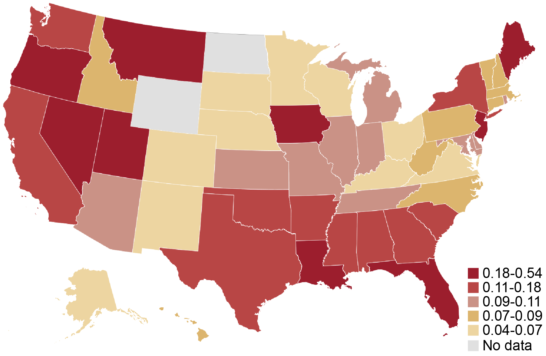 Source: Federal Reserve Banks, 2021 and 2022 Small Business Credit Surveys.
Notes: The heat map shows the fraction of firms in a given state that answered yes to the question “Within the past 12 months, did your business sustain direct or indirect losses from a natural disaster other than COVID-19 (e.g., hurricane, wildfire, earthquake, etc.)?” All observations that are missing a response to the question are excluded from the sample. The sample pools employer and nonemployer firms. Responses by employer and nonemployer firms are weighted separately on a variety of firm characteristics to match the national population of employer and nonemployer firms, respectively. To construct a pooled weight, we use the employer (nonemployer) weight for the sample year if the firm is an employer (nonemployer). The surveys were fielded between September and November of 2021 and 2022.
Are Minority-Owned Small Businesses in the Region More Likely to Report Disaster-Related Losses?
Natural disasters may have a detrimental impact on small businesses and particularly those owned by minorities, which are typically more resource-constrained and thus less resilient. A firm is defined as minority-owned if at least 51 percent of the firm’s equity stake is held by a minority (that is, an Asian, Black, Native American, or Hispanic) owner. A firm is defined as white-owned if at least 50 percent of its equity stake is held by non-Hispanic white owners. Race/ethnicity categories are not mutually exclusive. Disparities in the impact of natural disasters can arise because, for example, low-income and minority Americans are more likely to reside in high-risk flood zones. Conditional on exposure, disparities in the impact of natural disasters are also related to existing inequalities induced by historical practices like redlining.
We report the fraction of firms experiencing disaster-related losses in the Second District states, extending the data back to 2019. For firms overall, this fraction rose from 2 percent in 2019 to 18 percent in 2021 before stabilizing (see the left panel of the chart below). By race and ethnicity, we see disparities increasing continuously after 2019 (a year in which no minority firms in the three states in our sample reported experiencing natural disasters). In 2020, 4 percent of white-owned firms and 9 percent of minority-owned firms reported disaster-related losses; both of those percentages rose in 2021 and further again in 2022 to 12 percent and 29 percent, respectively (see the right panel in the chart below).
Qualitatively similar results obtain for the national sample although, by comparison, the disparity was lower in all years since 2020 (not pictured). The fraction of firms reporting disasters grew from about 7 percent in 2019 to about 15 percent in 2022 and disparities also rose alongside. For example, in 2022, 22 percent of minority-owned businesses faced disaster-related losses nationally versus 12 percent of white-owned businesses.
The Fraction of Firms in the Region with Losses and Disparities in Losses Have Both Increased since 2019
Percent
{"padding":{"auto":false,"left":21},"color":{"pattern":["#61AEE1","#B84645","#B1812C","#046C9D","#9FA1A8","#DCB56E"]},"interaction":{"enabled":true},"point":{"show":false},"data":{"groups":[],"labels":false,"type":"line","order":"desc","selection":{"enabled":false,"grouped":true,"multiple":true,"draggable":true},"x":"","rows":[["All"],["2.81"],["7.05"],["18.19"],["18.03"]]},"legend":{"show":true,"position":"bottom"},"tooltip":{"show":true,"grouped":true},"axis":{"rotated":false,"x":{"show":true,"type":"category","localtime":true,"tick":{"centered":false,"culling":false,"fit":true,"outer":true,"multiline":false,"multilineMax":0},"label":{"text":"","position":"outer-center"},"categories":["2019","2020","2021","2022"]},"y":{"show":true,"inner":false,"type":"linear","inverted":false,"tick":{"centered":false,"culling":false,"values":["20","15","10","5","0"]},"padding":{"top":3,"bottom":0},"primary":"","secondary":"","label":{"text":"","position":"outer-middle"},"max":20,"min":0},"y2":{"show":false,"inner":false,"type":"linear","inverted":false,"padding":{"top":3},"label":{"text":"","position":"outer-middle"}}},"grid":{"x":{"show":false,"lines":[],"type":"indexed","stroke":""},"y":{"show":true,"lines":[],"type":"linear","stroke":""}},"regions":[],"chartLabel":"Percent","trend":{"show":false,"label":"Trend"},"zoom":false,"subchart":false,"download":true,"downloadText":"Download chart","downloadName":"chart"}
Percent
{"padding":{"auto":false,"left":21,"right":0},"color":{"pattern":["#61AEE1","#B84645","#B1812C","#046C9D","#9FA1A8","#DCB56E"]},"interaction":{"enabled":true},"point":{"show":false},"data":{"groups":[],"labels":false,"type":"line","order":"desc","selection":{"enabled":false,"grouped":true,"multiple":true,"draggable":true},"x":"","rows":[["White","Minority"],["3.93","0.00"],["6.24","8.75"],["15.04","26.12"],["12.01","29.29"]]},"legend":{"show":true,"position":"bottom"},"tooltip":{"show":true,"grouped":true},"axis":{"rotated":false,"x":{"show":true,"type":"category","localtime":true,"tick":{"centered":false,"culling":false,"fit":true,"outer":true,"multiline":false,"multilineMax":0},"label":{"text":"","position":"outer-center"},"categories":["2019","2020","2021","2022"]},"y":{"show":true,"inner":false,"type":"linear","inverted":false,"tick":{"centered":false,"culling":false,"values":["30","25","20","15","10","5","0"]},"padding":{"top":3,"bottom":0},"primary":"","secondary":"","label":{"text":"","position":"outer-middle"},"max":30,"min":0},"y2":{"show":false,"inner":false,"type":"linear","inverted":false,"padding":{"top":3},"label":{"text":"","position":"outer-middle"}}},"grid":{"x":{"show":false,"lines":[],"type":"indexed","stroke":""},"y":{"show":true,"lines":[],"type":"linear","stroke":""}},"regions":[],"chartLabel":"Percent","trend":{"show":false,"label":"Trend"},"zoom":false,"subchart":false,"download":true,"downloadText":"Download chart","downloadName":"chart"}
Source: Federal Reserve Banks, 2022, 2021, 2020, and 2019 Small Business Credit Surveys. Notes: For respondents in each year and race/ethnicity category, the lines show the percentage of firms in the sample that answered yes to the question “Within the past 12 months, did your business sustain direct or indirect losses from a natural disaster other than COVID-19 (e.g., hurricane, wildfire, earthquake, etc.)?” A firm is defined as minority-owned if at least 51 percent of the firm’s equity stake is held by a minority (that is, an Asian, Black, Native American, or Hispanic) owner. A firm is defined as white-owned if at least 50 percent of its equity stake is held by non-Hispanic white owners. Race/ethnicity categories are not mutually exclusive. An observation is excluded from the sample if it is missing a response to the question or if the owner’s race is not observed. The sample pools employer and nonemployer firms. Responses by employer and nonemployer firms are weighted separately on a variety of firm characteristics to match the national population of employer and nonemployer firms, respectively. To construct a pooled weight, we use the employer (nonemployer) weight for the sample year if the firm is an employer (nonemployer). The surveys were fielded between September and November of each calendar year.
Among those small businesses located in disaster-affected areas in the sample, more minority-owned firms faced damages than white-owned firms. We show this by focusing on the subsample of small businesses located in counties designated as disaster-affected by the Federal Emergency Management Agency (FEMA) in the period of the survey. We find that 29 percent of minority-owned firms reported disaster-related losses in 2021 and 2022, compared to 12 percent of white-owned firms.
Do Minority-Owned Firms in the Region Suffer Larger Disaster-Related Losses?
The 2021 and 2022 surveys ask firms reporting disaster-related losses to estimate the value of losses resulting from natural disaster(s) and their revenues in the year prior. We normalize these losses as a percentage of a firm’s total revenue in the year prior.
Minority-owned businesses in the three states are disproportionately likely to experience disaster-related losses that were a large share of their revenues (see the chart below). For example, 38 percent of minority-owned businesses reported losses that amount to over 60 percent of 2019 revenue whereas just 18 percent of white-owned firms reported similar losses. In contrast, white-owned businesses were more likely to suffer moderate disaster-related losses. For example, 65 percent of white-owned firms experienced disaster-related losses of less than 30 percent while about 50 percent of minority-owned firms had similar losses. Qualitatively similar results obtain for the national sample (not pictured). For example, the share of minority-owned firms experiencing normalized losses of over 60 percent was about 30 percent as compared to 22 percent of white-owned firms.
More Minority-Owned Firms in the Region Have High Revenue Shares of Disaster-Related Losses
Percent
{"padding":{"auto":false,"left":22},"color":{"pattern":["#046C9D","#D0993C","#9FA1A8","#656D76","#8FC3EA","#0D96D4","#B1812C"]},"interaction":{"enabled":true},"point":{"show":false},"data":{"groups":[],"labels":false,"type":"bar","order":"desc","selection":{"enabled":false,"grouped":true,"multiple":true,"draggable":true},"x":"","rows":[["White, N=161","Minority, N=174"],["18.50","20.24"],["46.82","30.46"],["16.51","11.72"],["18.17","37.58"]]},"legend":{"show":true,"position":"bottom"},"tooltip":{"show":true,"grouped":true},"axis":{"rotated":false,"x":{"show":true,"type":"category","localtime":true,"tick":{"centered":false,"culling":false,"fit":true,"outer":true,"multiline":false,"multilineMax":0},"label":{"text":"","position":"outer-center"},"categories":["0% - 5%","5% - 30%","30%-60%","Over 60%"]},"y":{"show":true,"inner":false,"type":"linear","inverted":false,"tick":{"centered":false,"culling":false,"values":["50","40","30","20","10","0"]},"padding":{"top":3,"bottom":0},"primary":"","secondary":"","label":{"text":"","position":"outer-middle"},"max":50,"min":0},"y2":{"show":false,"inner":false,"type":"linear","inverted":false,"padding":{"top":3},"label":{"text":"","position":"outer-middle"}}},"grid":{"x":{"show":false,"lines":[],"type":"indexed","stroke":""},"y":{"show":true,"lines":[],"type":"linear","stroke":""}},"regions":[],"chartLabel":"Percent","trend":{"show":false,"label":"Trend"},"zoom":false,"subchart":false,"download":true,"downloadText":"Download chart","downloadName":"chart"}
Source: Federal Reserve Banks, 2021 and 2022 Small Business Credit Surveys.
Notes: Among firms that reported disaster-related losses, the 2021 and 2022 SBCS asks “What is the estimated value of your business’s losses as a result of the natural disaster?” Respondents can select from six categories. Firms are also asked to report their total revenues from 2019 by selecting from eight ranges. To compute the normalized revenue loss, we divide the midpoint of the disaster-related losses range by the midpoint of the firm’s revenue range. The normalized losses are grouped into four bins, which are shown on the x-axis. The bars show the percentage of firms in each race/ethnicity category with normalized disaster-related losses in a given bin. A firm is defined as minority-owned if at least 51 percent of the firm’s equity stake is held by a minority (that is, an Asian, Black, Native American, or Hispanic) owner. A firm is defined as white-owned if at least 50 percent of its equity stake is held by non-Hispanic white owners. Race/ethnicity categories are not mutually exclusive. An observation is excluded from the sample if it is missing a response to the question or if owner race is not observed. The sample pools employer and nonemployer firms. Responses by employer and nonemployer firms are weighted separately on a variety of firm characteristics to match the national population of employer and nonemployer firms, respectively. To construct a pooled weight, we use the employer (nonemployer) weight for the sample year if the firm is an employer (nonemployer). The surveys were fielded between September and November of 2021 and 2022.
The distribution of normalized losses is mostly driven by lower revenues of minority-owned firms, suggesting that natural disasters are a greater burden for minority-owned firms because they amplify existing racial disparities (related to, for example, harder access to start-up capital and credit) that have a negative effect on small business revenues.
A concern might be that, for 2021, our results are driven by greater revenue losses of minority-owned firms during the COVID-19 pandemic of 2020. To address this concern, we study normalized losses for 2022 alone and find a similar pattern. The results are also consistent with the distribution of normalized losses in 2020.
Looking Ahead
Our findings suggest that small businesses owned by minorities in the region have been more vulnerable to natural disasters than white-owned firms. Minority-owned small businesses nationally face challenges in accessing credit and are located in areas with underinvestment in climate infrastructure, and these challenges remain salient for the Second District. In the following post, we examine the resources that small businesses can rely on to cope with losses following disasters, such as access to disaster relief.
Asani Sarkar is a financial research advisor in Non-Bank Financial Institution Studies in the Federal Reserve Bank of New York’s Research and Statistics Group.
How to cite this post:
Asani Sarkar, “How Do Natural Disasters Affect Small Business Owners in the Fed’s Second District?,” Federal Reserve Bank of New York Liberty Street Economics, November 15, 2023, https://libertystreeteconomics.newyorkfed.org/2023/11/how-do-natural-dis....
How Do Natural Disasters Affect U.S. Small Business Owners?
Small Business Recovery after Natural Disasters
Disclaimer
The views expressed in this post are those of the author(s) and do not necessarily reflect the position of the Federal Reserve Bank of New York or the Federal Reserve System. Any errors or omissions are the responsibility of the author(s).
Nearly 6 Million Homes at Risk of Flooding as Rishi Sunak Cut Flood Protection Schemes
Newsletter offer
Receive our Behind the Headlines email and we'll post a free copy of Byline Times
Plans to better protect 336,000 homes from flooding have been cut by 40 per cent because of the huge rise in inflation caused partly by former Chancellor Kwasi Kwarteng’s budget that spooked the markets, the National Audit Office (NAO) reveals in a report today.
Now only 200,000 will get new flood protection by 2027 as 500 of 2000 planned flood protection schemes have been axed from the scheme announced in 2020. The NAO say up to two-thirds of the cuts are caused by the huge rise in inflation which has caused the “cost of living crisis”.
The scheme saw money allocated to flood protection in 2020 doubled to £5.2 billion over six years as the UK faced a big rise in heavy rainfall caused by climate change.
But now there is no more money available the Environment Agency has had to cut the programme.
The situation was made worse by Rishi Sunak when he was Chancellor in 2021 when he cut the money given to the Environment Agency to maintain existing flood protection schemes. He reduced the agency’s budget by £34 million to £201 million and £194 million the following year. As a result another 200,000 homes already covered by schemes will not get extra protection.
The number of homes at risk from flooding has been revised upwards from 5.2 million to 5.7 million following a new reassessment by the agency. Some 2.8 million are at risk from sea and river flooding, while 3.4 million are at risk from surface water flooding.

Rishi Sunak Trashed the UK’s Entire Climate Change Strategy for Nothing
New polling shows the Conservatives are set to lose big to Sadiq Khan in next year’s London mayoral election, despite Sunak’s attempts to weaponise, anti-green, anti-ULEZ votes
Adam Bienkov
Risks Increasing
The report says that in February 2022, the country experienced three named storms (Dudley, Eunice and Franklin) in one week for the first time. More than 370 properties were affected, mainly by river flooding. In July 2021, parts of London received a month’s rain within a couple of hours. More than 1,500 properties suffered from surface water flooding as a result.
“More recently, heavy, persistent and widespread rain affected much of England when Storms Babet and Ciaran struck in October and November 2023. The Met Office reported that 18th to 20th October was the third wettest independent three-day period for England and Wales in a series dating back to 1891. The Environment Agency (EA) reported that, by the end of October, Storm Babet alone had caused 2,200 homes to be flooded.”
The report also reveals that the new flood schemes require partnership arrangements with businesses and local councils to start work. This meant they have been slow to start because money has not been forthcoming from cash-strapped councils or businesses. This led to an underspend of £310 million which was returned to the Treasury for use as deferred spending on schemes in the future. The NAO is critical that neither the Treasury nor the agency thought of using the money to alleviate the cuts on maintenance imposed by Rishi Sunak.
Gareth Davies, the head of the NAO, said:
“The capital funding is forecast to better protect only 60% of properties that were promised when the programme was launched in 2020, while inflation and other programme risks mean the Environment Agency (EA) could deliver even fewer than that. If there are further delays to the capital programme, Defra must work with HM Treasury to make sure it is in a position to switch money quickly into maintenance, where this would provide value for money.
"EA will have to manage a record level of capital investment in flood defences for the remaining four years of the programme. In doing so, it must resist pressure to accelerate projects or initiate new ones too quickly, if this is likely to lead to cost overruns and delays and put value for money at risk.”
Flood Risk and Firm Location Decisions in the Fed’s Second District
The intensity, duration, and frequency of flooding have increased over the past few decades. According to the Federal Emergency Management Agency (FEMA), 99 percent of U.S. counties have been impacted by a flooding event since 1999. As the frequency of flood events continues to increase, the number of people, buildings, and agriculture exposed to flood risk is only likely to grow. As a previous post points out, measuring the geographical accuracy of such risk is important and may impact bank lending. In this post, we focus on the distribution of flood risk within the Federal Reserve’s Second District and examine its effect on establishment location decisions over the last two decades.
Where Is Flood Risk Concentrated in the Second District?
Coastal flooding occurs when water inundates or covers normally dry coastal land, while riverine flooding occurs when streams and rivers exceed their natural or constructed capacity. We leverage county-level data on both coastal and riverine flood risk scores, provided by the FEMA National Risk Index (NRI), to build an aggregate flood risk score for counties in the Second District as of March 2023. We sort Second District counties into risk quartiles and plot their distributions in Panel 1 (Puerto Rico and the U.S. Virgin Islands are omitted due to insufficient data).
Flood Distribution in the Fed’s Second District
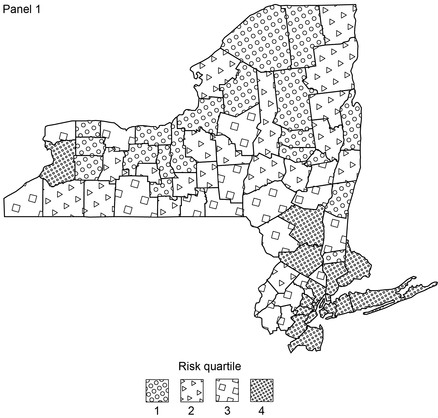
Source: Federal Emergency Management Agency.
Note: Higher risk quartiles correspond to higher flood risk.
The counties with the highest flood risk in the Second District also tend to be the most populated; the correlation between flood risk score and population is 0.78. All ten of the most populated counties in the Second District are also in the top quartile of flood risk score and make up nearly three-fourths of the total population of New York State, according to population data recorded in FEMA’s Hazus 6.0 release. Geographically, the riskiest counties are concentrated in the Long Island, South-Eastern, and City Metro Regions of New York. The two exceptions lie in Fairfield County, located in Connecticut, and Erie County, home of Buffalo and located in the North-Eastern region. Combined, high-risk counties account for over $3 trillion in building value and $775 million in agricultural value, based on the authors’ calculations using county-level FEMA NRI data.
Are New Firms Avoiding Flood-Prone Counties?
To understand the evolution of establishment location relative to flood risk, we use county-level data on establishment locations from the National Establishment Time Series (NETS). An establishment refers to an economic unit that engages in a business activity at a single physical location. NETS reports business sector microdata, enabling us to observe county-level establishment counts across time.
We begin by plotting the distribution of the number of establishments over the flood risk map, as presented in Panel 2a below. We preserve the patterns of the riskiest and safest counties from Panel 1 to illustrate their contrast. Panel 2a highlights that back in 2000, establishments tended to be concentrated in the riskiest counties—the correlation between the number of establishments and our flood risk score is 0.71. This correlation likely reflects the fact that population in the Second District is predominantly concentrated in counties with high exposure to flood risk; indeed, the correlation between the number of establishments and population size is 0.83 across counties.
Concentration and Growth of Establishments
Sources: National Establishment Time Series (NETS); Federal Emergency Management Agency.
Notes: Panel 2b shows the distribution of the ratio of establishments in 2019 to 2000 across all industries.
To get a sense of the potential importance that flood risk may have played in business owners’ geographical location decisions within the Second District, we plot the distribution of the growth of the number of establishments between 2000 and 2019 in Panel 2b, overlaid with the flood risk map as of March 2023. We use flood risk data as of March 2023 because historical data are unavailable.
Interestingly, the counties with the highest growth rates in the number of establishments were not the counties with the lowest risk of flooding; to the contrary, the riskiest counties recorded the fastest pace of establishment growth. Similarly, the counties with the lowest rates of establishment growth were not the riskiest counties but rather relatively safe counties. To control for population size, we conduct the same analysis based on the number of establishments per person, yielding consistent results. Based on these trends, flood risk does not seem to have been the primary determinant of business location decisions.
Of course, it is plausible that the observed lack of importance of flood risk in influencing establishment location may be driven by the first half of our sample period. After all, attention to the risk of climate change has increased over time. To ascertain whether this is the case, we replicate Panel 2b in Panels 3a and 3b, but for the periods preceding and following Hurricane Sandy (October 2012), one of the most damaging hurricanes in the United States to this point, causing $50 billion in damages. While there appears to be a change in the composition of high growth counties before and after Hurricane Sandy, the shift is observed primarily within risk quartiles, rather than across them, consistent with Panel 2b.
Establishment Growth Before and After Hurricane Sandy
Sources: National Establishment Time Series (NETS); Federal Emergency Management Agency.
Establishments’ Geographical Location by Industry
To further understand the potential importance of flood risk on establishments’ location decisions, we investigate growth rates over the last two decades for establishments in the three most prevalent industries in the Second District based on SIC2 code classification: Business, Health, and Engineering & Management services. Business services encompass establishments primarily engaged in providing services, on a contract or fee basis, such as advertising, mailing, computer programming, and help supply services. Health Services, in turn, includes establishments primarily engaged in furnishing medical, surgical, and other health services. Finally, Engineering & Management establishments primarily engage in providing engineering, architectural, and surveying services (for example, accounting, research, and public relations services).
We plot the growth of the number of establishments for each of these industries in Panels 4-6. Interestingly, Panel 4 shows that four of the safest counties ranked among the top ten in terms of Business Service establishment growth. However, five of the top ten growth rates in this category were also claimed by counties in the riskiest quartile; and the top three counties overall are all located in the flood-prone New York City Metro region. Similar patterns are observed when examining growth rates for Health Service establishments and Engineering & Management Service establishments (see Panels 5 and 6). Overall, these findings are consistent with the evidence observed for all industries—we do not find evidence of a migration of establishments from high-risk areas to low-risk areas.
Growth in Number of Business Service Establishments,
2000-19
Sources: National Establishment Time Series (NETS); Federal Emergency Management Agency.
Growth in Number of Health Service Establishments,
2000-19
Sources: National Establishment Time Series (NETS); Federal Emergency Management Agency.
Growth in Number of Engineering & Management Service Establishments, 2000-19
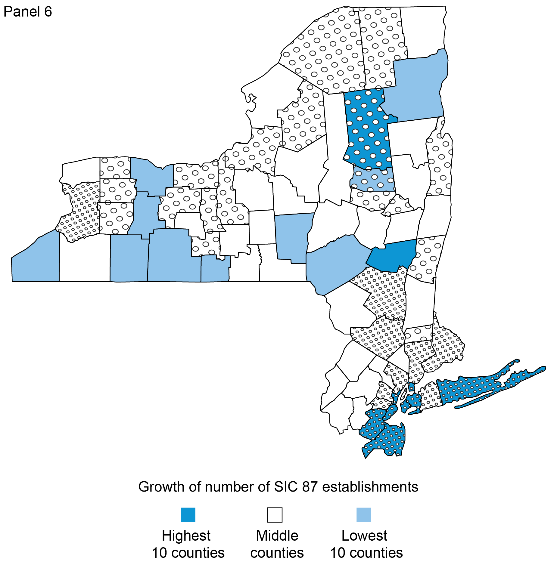
Sources: National Establishment Time Series (NETS); Federal Emergency Management Agency.
Conclusion
In this blog post, we assess potential links between establishments’ location decisions and flood risk in the Second District. Our exploratory analysis highlights that counties with greater exposure to flood risk also tend to be the counties with the highest concentration of establishments. In addition, we do not find evidence that flood risk is deterring the growth of establishments in the Second District, suggesting that counties most exposed to flood risk will continue to play an important role in the region’s economy. The next post in the Extreme Weather series further explores the potential impact of climate change risks on economic activity in the Second District, focusing on the impact of natural disasters on small business owners.

Oliver Zain Hannaoui is a research analyst in the Federal Reserve Bank of New York’s Research and Statistics Group.

Hyeyoon Jung is a financial research economist in Climate Risk Studies in the Federal Reserve Bank of New York’s Research and Statistics Group.

João A.C. Santos is the director of Financial Intermediation Policy Research in the Federal Reserve Bank of New York’s Research and Statistics Group.

Lee Seltzer is a financial research economist in Climate Risk Studies in the Federal Reserve Bank of New York’s Research and Statistics Group.
How to cite this post:
Oliver Zain Hannaoui, Hyeyoon Jung, João A.C. Santos, and Lee Seltzer, “Flood Risk and Firm Location Decisions in the Fed’s Second District,” Federal Reserve Bank of New York Liberty Street Economics, November 14, 2023, https://libertystreeteconomics.newyorkfed.org/2023/11/flood-risk-and-fir....
Moving Out of a Flood Zone? That May Be Risky!
Potential Flood Map Inaccuracies in the Fed’s Second District
Disclaimer
The views expressed in this post are those of the author(s) and do not necessarily reflect the position of the Federal Reserve Bank of New York or the Federal Reserve System. Any errors or omissions are the responsibility of the author(s).
How Do Banks Lend in Inaccurate Flood Zones in the Fed’s Second District?
In our previous post, we identified the degree to which flood maps in the Federal Reserve’s Second District are inaccurate. In this post, we use our data on the accuracy of flood maps to examine how banks lend in “inaccurately mapped” areas, again focusing on the Second District in particular. We find that banks are seemingly aware of poor-quality flood maps and are generally less likely to lend in such regions, thereby demonstrating a degree of flood risk management or risk aversion. This propensity to avoid lending in inaccurately mapped areas can be seen in jumbo as well as non-jumbo loans, once we account for a series of confounding effects. The results for the Second District largely mirror those for the rest of the nation, with inaccuracies leading to similar reductions in lending, especially among non-jumbo loans.
Inaccurate Flood Maps
As manager of the National Flood Insurance Program (NFIP), the Federal Emergency Management Agency (FEMA) works with communities to draw maps that denote the risk of a catastrophic flood occurring at least once in 100 years. Areas that are at risk of such flooding are considered to have a 1 percent (or more) annual flood risk. An important implication of being in a flood zone is the insurance requirement for mortgage borrowers. Specifically, any mortgage applicant in a flood zone whose mortgage meets certain criteria—such as being eligible for securitization or being made by a financial institution—must buy flood insurance. The program—as well as the implications for the mortgage market—are discussed in previous Liberty Street Economics posts in this series (see here or here).
In our previous post, we discussed the fact that certain flood maps may be inaccurate. These inaccuracies arise partly because it takes time to update the maps in the face of climate change, and partly because of improvements and other changes made to local infrastructure and building materials that take time to be reflected in official flood maps. We use property-level information on flood damage exposure from CoreLogic as well as digitized flood maps for 2022 to define inaccuracies (as described in our previous post).
Maps can be inaccurate in one of two ways: either they designate too much of an area as being a “flood risk,” or they designate too little. For the purposes of this post, we focus only on the latter issue and define two categories of inaccuracy. If a property faces significant flooding damage (highest damage quartile) but is not “mapped” into a flood zone, its map is “very inaccurate.” If a property faces moderate damage but is not covered by a flood zone, its map is simply “inaccurate.” All other properties are either accurately mapped or correctly excluded from a flood map because they face no flood risk. We collapse this data at the census-tract level and then calculate the share of each census tract that is “very inaccurate” and “inaccurate” in the analyses below. This somewhat coarse analysis is necessary as we cannot use address-specific mortgage data. As before, we focus on properties in the Second District as well as the nation as a whole for mortgage applications in 2019 and 2020.
A key question is whether lenders are aware of—and responsive to—these inaccuracies. To this end, we make use of Home Mortgage Disclosure Act (HMDA) mortgage data at the census tract level. We first look at simple correlations between the share of a census tract that is “very inaccurate” and the acceptance rate of loan applications. In the left panel of the chart below, we see that for non-jumbo (“conforming”) loans, there is very little relationship between the two variables. This is possibly a consequence of many of these loans moving off of a bank’s balance sheet in the near term. However, jumbo loans, which are more likely to be retained by banks, show a much more negative correlation, as shown in the right panel. In other words, census tracts in which a greater proportion of homes are inaccurately mapped see a lower acceptance rate for jumbo applications, on average.
Lending in Areas with Inaccurate Flood Maps
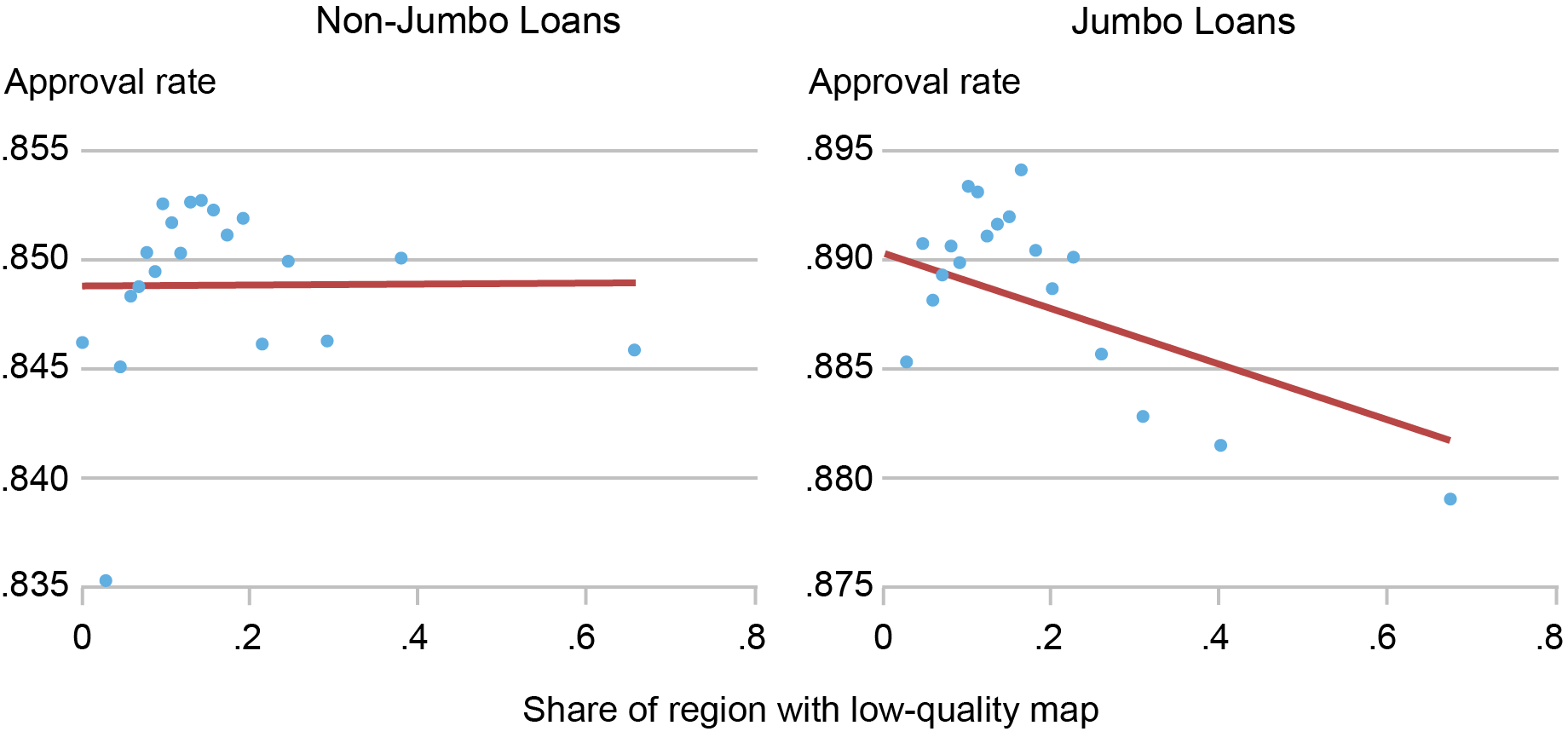
Sources: Authors’ calculations; Federal Emergency Management Agency (FEMA); Home Mortgage Disclosure Act (HMDA) data; CoreLogic.
Notes: This chart shows binscatter plots that relate the share of a census tract that is “very inaccurately” mapped to the loan acceptance rate. It includes time controls but no other adjustments. Data cover the Second District excluding Puerto Rico and the U.S. Virgin Islands and are split into conforming (non-jumbo) and non-conforming (jumbo) loans.
This result is possibly a reflection of bank risk management. Retaining a loan that is subject to flood risk but that may not have flood insurance (or may even be ineligible for insurance from the NFIP if the community does not participate) may represent too risky a proposition. However, since a whole host of other factors go into a mortgage application decision, we use regression analysis to control for these other factors.
The Effect of Flood Map Accuracy on Lending
Our outcome variable is the loan acceptance probability as measured by a variable that takes the value of “1” if an application is accepted. We regress the loan acceptance probability on application amounts in dollars, borrower characteristics (income, gender, race, and loan-to-income ratio), the county where the property is located interacted with time, the average census tract income, past flood damages, and a host of other characteristics. We also include a variable that denotes the share of properties in a census tract that are (1) “inaccurately mapped” or (2) “very inaccurately mapped.” Results are shown in the chart below.
Effect of Inaccurate Maps, after Accounting for Borrower and Region Characteristics
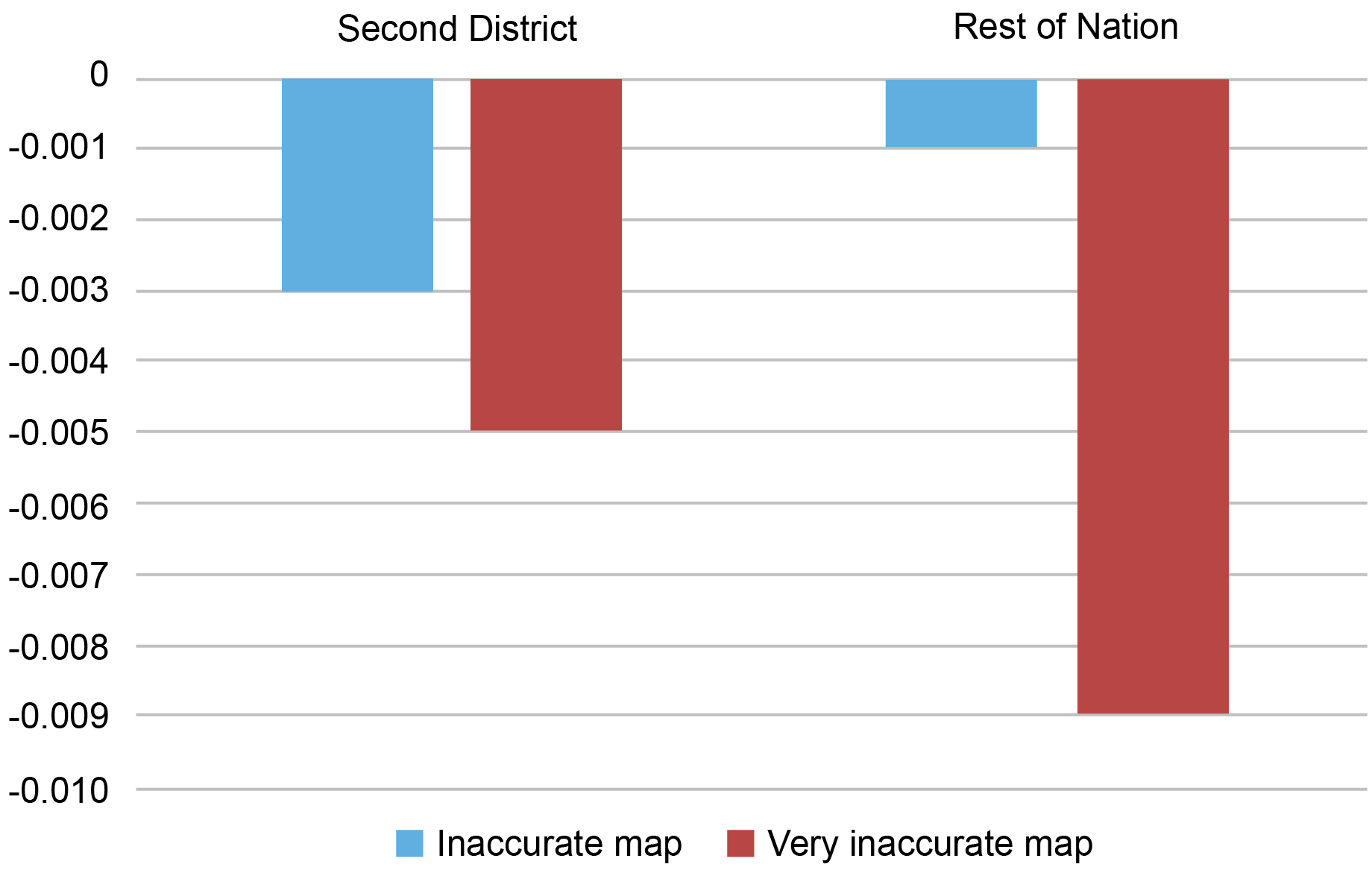
Sources: Authors’ calculations; Federal Emergency Management Agency (FEMA); Home Mortgage Disclosure Act (HMDA) data; CoreLogic.
Notes: This chart shows the key coefficients for a linear probability regression that relates loan acceptance rates (1= accepted by borrower and bank) to a host of loan, region, and borrower characteristics, as well as key variables that denote the share of properties in a census tract that are “inaccurately mapped” or “very inaccurately mapped.” It shows the Second District (excluding Puerto Rico and the U.S. Virgin Islands) and the rest of the nation separately and focuses only on the coefficients of interest for non-jumbo loans.
We find that bank loans in areas that have inaccurate maps have a somewhat lower acceptance rate, all else equal. Areas that have very inaccurate maps see a more pronounced reduction in acceptances. If we include borrower characteristics—especially borrower income and loan-to-value ratios—the relationship between the share of inaccurately mapped properties and loan acceptance rates becomes less negative among jumbo loans than in the raw correlation. This may be a reflection of the ability of these borrowers to make a larger down payment to help offset the bank’s perceived risk.
It is worth mentioning that while these reductions in the acceptance rates are statistically significant, they are small relative to the effects of applicant income or wealth. A Second District community in which 10 percent of all properties are inaccurately mapped may see a reduction of 3 percent in acceptance rates. A 10 percent drop in income would see a rejection response that is fourfold larger. Our results likely reflect some residual bank risk aversion—not all conforming loans are securitized, after all. Moreover, banks that are aware of the inaccurate mapping likely expect maps to change following future updates. Since lenders/servicers have to ensure that pre-existing borrowers who are newly mapped into flood zones buy insurance after a grace period expires, they may be ex ante unwilling to lend to these inaccurately mapped households. Alternatively, banks may be worried about the ability of the marginal borrower to make the required insurance payments.
The reaction of lenders to inaccurate maps in the Second District is comparable to that in the nation as a whole, especially among non-jumbo borrowers. The response to very inaccurate maps is somewhat stronger in southern states, which may reflect increased risk of catastrophic flooding. While we do not fully account for a wide range of region-specific factors that may differ between the Second District and the rest of the nation, we still find that bank responses to inaccuracies are broadly comparable—that is to say, they reduce lending. This suggests that bank reactions to inaccurate maps are not state-specific but are more likely to be a reflection of general risk aversion.
Concluding Remarks
We find that banks are somewhat responsive to inaccurately mapped areas. They are less willing to lend in regions with poor flood maps, even if these loans can be securitized. In this regard, the Second District is no different than the rest of the nation. While bank reactions to inaccurate maps are small, the presence of statistically meaningful lending differences implies that banks manage and are aware of flood risk, at least to some degree. The next post in this series exploits the newly updated maps to examine whether firms take flood risk into account when choosing their business locations.

Kristian Blickle is a financial research economist in Climate Risk Studies in the Federal Reserve Bank of New York’s Research and Statistics Group.
Katherine Engelman is a former data scientist in the Data and Analytics Office in the Bank’s Technology Group.

Theo Linnemann is a data scientist in the Data and Analytics Office in the Bank’s Technology Group.
João A.C. Santos is the director of Financial Intermediation Policy Research in the Federal Reserve Bank of New York’s Research and Statistics Group.
How to cite this post:
Kristian S. Blickle, Katherine Engelman, Theo Linnemann, and João A. C. Santos, “How Do Banks Lend in Inaccurate Flood Zones in the Fed’s Second District?,” Federal Reserve Bank of New York Liberty Street Economics, November 13, 2023, https://libertystreeteconomics.newyorkfed.org/2023/11/how-do-banks-lend-....
Potential Flood Map Inaccuracies in the Fed’s Second District
The Adverse Effect of “Mandatory” Flood Insurance on Access to Credit
Moving Out of a Flood Zone? That May Be Risky!
Disclaimer
The views expressed in this post are those of the author(s) and do not necessarily reflect the position of the Federal Reserve Bank of New York or the Federal Reserve System. Any errors or omissions are the responsibility of the author(s).